App Icon Design: A Developer's Platform-First Guide
A production-ready app icon is a single high-contrast silhouette built as a layered master asset that exports to each platform’s required sizes. Before you open any design tool, take three actions: define your core silhouette, build a 1024px square layered master, and run the 40-pixel silhouette test to catch failures before export.
Define the silhouette first. Sketch your icon as a solid black shape on white. If it reads clearly at thumbnail size, the concept works. If it doesn’t, no color or gradient will save it.
Build a layered master at 1024×1024 pixels. Separate foreground and background layers from the start. Both Apple and Android renderers expect this structure, and it lets you derive every platform variant from one source file.
Run a silhouette test at small size to ensure legibility. Scale your master down to 40px and check whether the shape still reads. This single test predicts most real-world failures before you touch an export dialog.
Your three must-check references: Apple Human Interface Guidelines, Google Play icon specifications, and Microsoft Learn’s Windows app icon guidance.
Key Takeaways
A production-ready app icon requires a layered 1024×1024 master, a passing 40-pixel silhouette test, and platform-specific exports with no alpha on iOS and adaptive layers for Android.
PointDetailsSilhouette-first designYour icon must read as a distinct shape at 40px in grayscale before any color is applied.Layered 1024px masterBuild one layered source file; both Apple and Android renderers derive variants from foreground/background separation.No alpha on iOSThe App Store requires a flattened 1024×1024 PNG with no transparency; alpha triggers upload rejection.Adaptive layers for AndroidSupply foreground and background PNGs separately; Android applies mask shapes and themed monochrome tinting from these layers.Apptenium icon generatorUpload your master to Apptenium’s free icon generator to export correctly sized iOS and Android assets without manual resizing.
Table of Contents
What makes app icon design work at every size
The rules that separate a forgettable icon from a recognizable one are not aesthetic preferences. They are structural constraints that the OS enforces on your behalf.
One metaphor, one shape. Your icon should communicate a single idea through a single dominant form. A camera, a lightning bolt, a speech bubble. The moment you add a second symbol to “explain” the first, you’ve lost the plot. Users identify apps quickly, and a cluttered icon registers as noise.
Silhouette-first design is non-negotiable. The WWDC guidance on icon design is direct: design for a clear silhouette, test in context at small sizes, and favor a single recognizable glyph. If your icon’s shape is ambiguous as a black cutout, the color palette is doing work it shouldn’t have to do.
Contrast and color survive context changes. Your icon appears on home screens with wildly different wallpapers, inside folders, in notification badges, and in themed monochrome modes on both iOS and Android. A palette that relies on subtle hue differences will fail in grayscale. Aim for a foreground element that reads clearly against both light and dark backgrounds, and test it in monochrome before committing to a color scheme.
Stroke and element thickness matter. Thin strokes below 3px at 60px render size become invisible or aliased. Keep your primary mark bold enough to survive aggressive downscaling.
No text, with one exception. Avoid words, taglines, or your app’s full name. A single-letter brand mark (think “f” or “G”) can work when it’s large, bold, and the letter itself is the brand. Anything more than one character becomes unreadable at small sizes and looks cluttered at large ones.
Flat marks versus subtle depth. Flat, high-contrast marks are the safest choice for legibility across all contexts. Subtle depth through gradients or layering can add polish, but let the OS handle the heavy lifting. Apple’s Liquid Glass system applies its own material effects to your layers; adding hand-painted highlights on top creates visual conflicts. Supply clean layers and trust the renderer.
Pro Tip: Before opening Figma or Illustrator, spend five minutes sketching your icon concept as a black silhouette on paper. If you can’t draw it in under 30 seconds, it’s probably too complex.
What each platform actually does to your artwork
Understanding platform processing is what separates developers who get clean approvals from those who iterate through rejections.
Apple (iOS, macOS, watchOS)
Apple expects a 1024×1024 PNG with no alpha channel for App Store submission. The system applies rounded corners and Liquid Glass material effects automatically, so you supply square, unmasked layers. Per the Apple Human Interface Guidelines, your source should be layered, with foreground and background separated, so Icon Composer can configure appearance variants including dark, tinted, and monochrome modes. Never add your own corner mask or drop shadow to the submitted asset; the OS renders those.

The App Store asset best practices page reinforces this: keep your store listing icon and your in-binary icon identical. Mismatched artwork between the two is a common reviewer flag. Use Icon Composer to preview all appearance modes before submission.
Google Play and Android devices
Google Play requires a 512×512 store asset as a 32-bit PNG. Play dynamically applies rounded corner masks and drop shadows, so upload full-bleed artwork without pre-applied masks. Inside your app bundle, supply adaptive icon layers: a foreground PNG and a background PNG (or color). Android devices use these layers to apply the user’s chosen mask shape and, on supported launchers, wallpaper-tinted themed icons. Your foreground mark must work in pure white or monochrome because themed icon mode strips all color.
Windows
Microsoft’s guidance centers on grid alignment and balanced silhouettes. Windows icons appear at multiple sizes (16×16 through 256×256), so your design must hold up without detail at the smallest sizes. Microsoft recommends limiting fine detail and following numeric corner radius and shadow scaling guidance at 48×48px. For accessibility, consider supplying a separate high-contrast asset.
Common rejection traps
TrapPlatformFixAlpha channel in PNGiOS / App StoreExport as flattened PNG, no transparencyPre-applied corner maskiOS, AndroidSupply square, unmasked artworkText beyond a single letterAll platformsRemove text; use a symbol insteadStore icon differs from in-binary iconiOSUse Icon Composer to sync bothForeground mark invisible in monochromeAndroidTest in pure white before exportImpersonation of platform UIAll platformsAvoid OS chrome, status bars, or system icons
Practical mechanics: grids, corners, layers, and color
Getting the mechanics right at the master-file stage saves hours of rework downstream.
Use an icon grid. A keyline grid gives your focal shape a visual center that survives different mask shapes. The standard approach places a circle, square, and rounded-square keyline on the canvas so you can align your primary mark to the optical center rather than the geometric center. Optical centering matters because shapes with visual weight at the top (like a flame or an arrow) read as bottom-heavy when geometrically centered.
Corner radii scale with size. You don’t control the corner radius on iOS or Android; the OS applies it. On Windows, Microsoft’s guidance provides numeric corner and shadow recommendations at 48×48px as a reference point. Design your artwork to avoid placing critical content near the edges, since every platform will mask those corners.
Silhouette construction rules:
Keep your primary element inside the safe zone (roughly the inner 80% of the canvas).
Avoid extreme thick-to-thin stroke contrasts in a single shape; they create aliasing artifacts at small sizes.
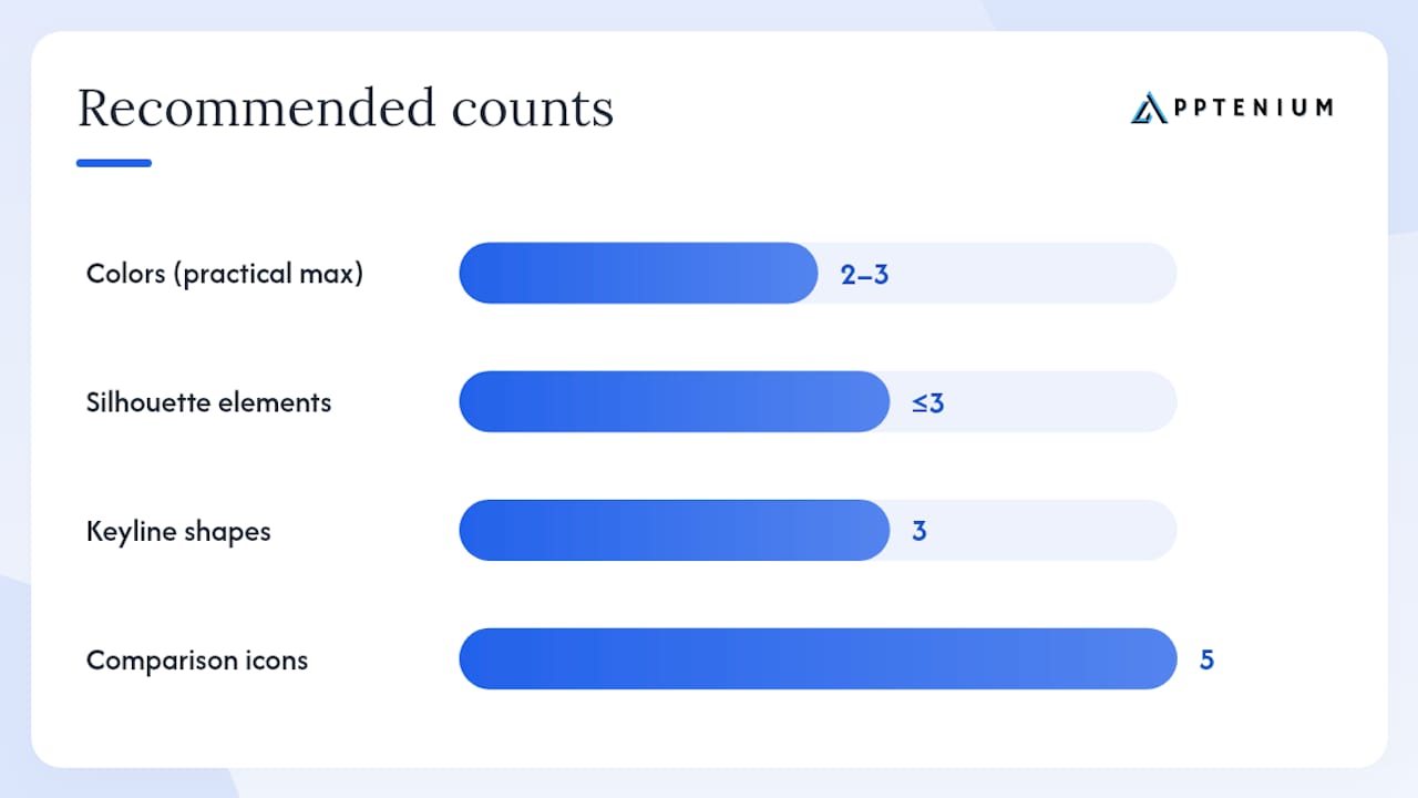
Minimize the total number of distinct shapes. Three or fewer elements is a reliable ceiling.
Never rely on a thin outline to define a shape; fill it instead.
Layering for depth without clutter. Separate your foreground mark from your background layer cleanly. Avoid painting highlights or shadows directly onto the foreground layer; Apple’s Liquid Glass renderer will apply material effects, and hand-painted highlights conflict with system-applied ones. A gradient background is fine and often adds polish, but keep it simple: two colors, a clear direction.
Color strategy. Two to three colors is the practical maximum for a legible icon. Test your palette in monochrome and in the tinted icon mode that Android and iOS both support. Accessible contrast between your foreground mark and background is not just a nice-to-have; it determines whether your icon reads in low-light conditions and for users with color vision differences.
Pro Tip: Export your master at 40×40px as a grayscale PNG and place it next to five icons from your target category. If yours doesn’t stand out as a distinct shape, redesign the silhouette before touching color.
Exact export sizes, formats, and folder structure
A reproducible export workflow means you generate every required asset once and never scramble before a submission deadline.
PlatformAssetSizeFormatNotesiOS / App StoreStore icon1024×1024PNG, no alphaFlattened, square, unmaskediOS in-appHome screen60×60PNGGenerated from master via XcodewatchOSStore icon1024×1024PNG, no alphaLarger master requiredAndroid / Play StoreStore listing512×51232-bit PNGFull-bleed, no pre-applied maskAndroid adaptiveForeground layer108×108dpPNGSafe zone: inner 80% of canvasAndroid adaptiveBackground layer108×108dpPNG or colorSolid or simple gradientWindowsShell / taskbar256×256 to 16×16PNG or ICOGrid-aligned, multiple sizes
Export workflow
Start from your 1024×1024 layered master. Keep foreground and background as separate layers in your source file (Figma, Illustrator, or Photoshop).
Export the iOS App Store asset. Flatten the master, confirm no alpha channel, and export as PNG. Verify in Preview or Photoshop that the alpha channel is absent.
Generate iOS in-app sizes via Xcode. Drop your 1024×1024 PNG into an Xcode asset catalog (
AppIcon.appiconset). Xcode generates the required sizes automatically.Export Android adaptive layers. Export foreground and background as separate 108×108dp PNGs. Use Android Studio’s Image Asset Studio to generate adaptive, legacy, round, and Play Store preview assets from these layers. Image Asset Studio also previews how different mask shapes will clip your artwork.
Export the Play Store 512×512 asset. Full-bleed, 32-bit PNG, no pre-applied mask or shadow.
Generate Windows assets. Export at 256×256, 48×48, 32×32, and 16×16. Name files consistently:
icon_256.png,icon_48.png, etc.Organize your folder structure. For Android:
res/mipmap-mdpi/,res/mipmap-hdpi/,res/mipmap-xhdpi/,res/mipmap-xxhdpi/,res/mipmap-xxxhdpi/. For iOS: use the Xcode asset catalog. Keep a/store-assets/folder at the repo root for Play and App Store upload files.
How to test icons before you ship
Testing is where most teams cut corners and pay for it in conversion rate.
Run a silhouette test at small size to ensure legibility. Scale your icon to 40px, convert to grayscale, and check whether the shape reads as a distinct form. This is the single most predictive pre-export check.
Preview on a real home screen. Set your icon as a test app icon on an actual device and place it in a folder alongside similar-category apps. Folder view is where icons compete most directly.
Check the App Library and notification badge. iOS renders your icon at very small sizes in the App Library grid and as a notification badge. Both contexts strip detail aggressively.
Test against light and dark wallpapers. A dark icon on a dark wallpaper disappears. A light icon on a white background loses its edge. Test both extremes.
Preview themed and monochrome modes. On Android, enable themed icons in developer settings. On iOS, use Icon Composer to preview dark, tinted, and monochrome appearance variants. Your foreground mark must read clearly in pure white.
Check the Play Store and App Store thumbnails at 60px. Both stores display your icon at small sizes in search results. This is where install conversion decisions happen.
Use Icon Composer for Apple variants. The Icon Composer tool lets you import your layers and preview every appearance mode before submission, catching conflicts between your artwork and system-applied effects.
Pro Tip: Build a single test image that shows your icon at 1024px, 512px, 60px, and 40px side by side, in both color and grayscale. Share this sheet with a colleague who hasn’t seen the design. If they can’t describe the icon’s concept in one word at the 40px size, iterate.
Which tools actually help you build and export icons
The right toolset depends on where you are in the workflow.
Vector-first design tools:
Figma is the most practical choice for most teams. Its component and variant system makes it straightforward to manage foreground/background layers, and the export dialog handles multiple sizes cleanly. Community templates for iOS and Android keyline grids are widely available.
Adobe Illustrator remains the gold standard for vector precision. If your icon involves complex paths or custom letterforms, Illustrator’s anchor-point control is unmatched. Export to PNG at any size without quality loss.
Adobe Photoshop is useful for raster-heavy icons with photographic elements, but vector-first is almost always the better approach for scalability.
Platform tooling:
Icon Composer (Apple): Import your layered source, configure Liquid Glass appearance modes, and preview dark, tinted, and monochrome variants. Export per-platform assets directly. Essential for any iOS/macOS submission.
Android Studio Image Asset Studio: Generates adaptive icons, legacy launcher icons, and a Play Store preview asset from your foreground and background layers. Previews mask shapes and density variants. The fastest path to a correctly structured Android export.
Apptenium’s app icon generator fits into the workflow at the export stage: upload your master asset and generate correctly sized iOS and Android exports without manually configuring each size. For teams managing multiple apps, this removes a repetitive step from every release cycle.
Templates and starter packs:
Apple’s developer documentation includes downloadable Figma and Sketch keyline templates.
Google’s Material Design resources include adaptive icon templates with the safe zone marked.
The Apptenium top apps gallery shows high-performing icon patterns by category, useful for understanding what visual conventions dominate your target category before you design against or with them.
For broader brand alignment between your icon and your product’s visual identity, the principles in logo and brand design practice guides apply directly: consistency between your icon mark and your wider brand system builds recognition across every touchpoint.
Your icon design checklist from concept to ship
Follow these steps in order. Each one builds on the last.
Define your silhouette and palette. Sketch the icon as a black shape. Choose two to three colors. Confirm the silhouette reads at 40px before proceeding.
Build the layered 1024×1024 master. Separate foreground and background layers. Keep the primary mark inside the inner 80% of the canvas.
Export the iOS App Store asset. Flatten, remove alpha, export as 1024×1024 PNG. Verify no transparency.
Generate iOS in-app sizes. Add the master to your Xcode asset catalog and let Xcode generate required sizes.
Export Android adaptive layers. Foreground and background as 108×108dp PNGs. Run Image Asset Studio to generate adaptive, legacy, and round variants.
Export the Play Store 512×512 asset. Full-bleed, 32-bit PNG, no pre-applied mask.
Generate Windows assets. Export at 256×256, 48×48, 32×32, and 16×16. Follow grid alignment guidance.
Run the 40px silhouette test and monochrome check. Fix any legibility issues before uploading.
Preview in Icon Composer. Confirm dark, tinted, and monochrome variants look correct.
Verify store and in-binary icons match. Mismatched artwork triggers reviewer flags on iOS.
Upload to Play Console and App Store Connect. Confirm no upload validation errors (alpha channel, wrong dimensions).
Run a store listing experiment. Test a structurally different silhouette variant, not just a color change, to detect meaningful lift in tap-through rate.
Why your icon is an ASO asset, not just a design artifact
Most developers treat the icon as a design task that ends at submission. That framing costs installs.
Your icon is the first visual signal a potential user evaluates in a search result. It appears alongside your app name and rating before any screenshot is visible. At that moment, it’s doing conversion work, not branding work. An icon that reads clearly at 60px in a crowded search result drives more taps than a beautiful icon that blurs into the grid.
The data-driven angle matters here too. Store listing experiments on both the App Store and Google Play let you test icon variants against real traffic. The key insight from testing practice: hue-only changes rarely produce statistically meaningful results at indie traffic levels. Structural changes, a different silhouette, a different primary shape, are what move the needle. That’s why the silhouette-first approach described throughout this guide isn’t just a design preference. It’s the variable that store experiments can actually detect.
Tying icon iteration to your broader ASO workflow, tracking keyword rank alongside tap-through rate, is how you close the loop between design decisions and growth metrics. Apptenium’s ASO platform connects those data points in one place, so you’re not correlating a design change against a download spike in a spreadsheet.
Apptenium covers the icon workflow and the ASO loop
Getting your icon right is half the equation. Knowing whether it’s working in the store is the other half.
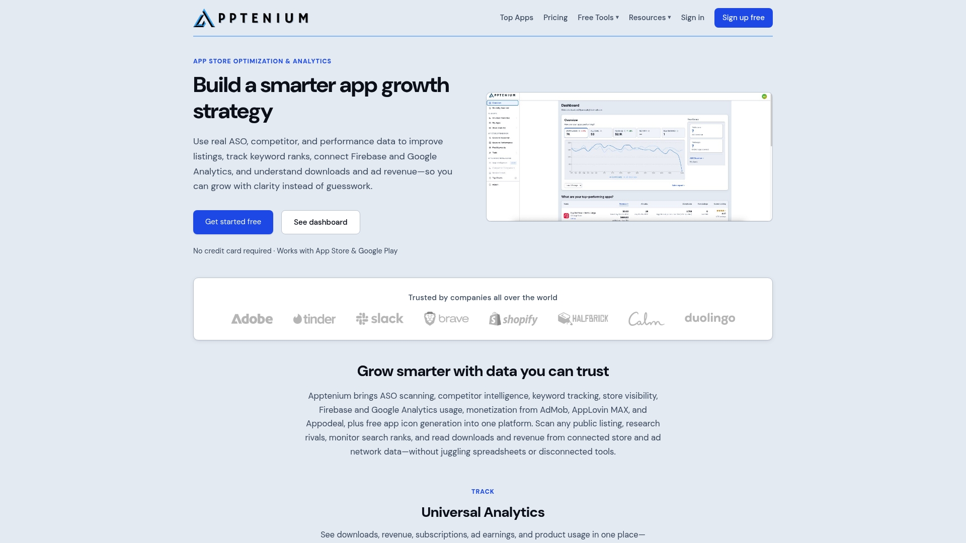
Apptenium gives you both. The free app icon generator takes your 1024×1024 master and outputs correctly sized iOS and Android exports, including adaptive icon layers, without manual resizing. Beyond the icon, Apptenium’s ASO platform tracks keyword rankings, monitors competitor visibility, and surfaces AI-powered recommendations for your store listing. When you run a store listing experiment on your icon, Apptenium’s performance reporting shows you whether the change moved downloads or revenue, not just impressions.
Icon export automation: Generate iOS, Android adaptive, and Play Store assets from one master upload.
Listing experiment tracking: Connect icon A/B test results to download and revenue data.
ASO scanning and keyword monitoring: Track how your listing performs after every change.
Start with the free icon generator at Apptenium and run your first ASO scan to see where your listing stands today.
Sources
FAQ
What size should my app icon master file be?
Build your master at 1024×1024 pixels for iOS and Android. Apple requires this exact size for App Store submission; Google Play requires a 512×512 PNG for the store listing, which you export separately from the same master.
Does my iOS icon need a transparent background?
No. Apple requires a flattened PNG with no alpha channel. A transparent background will fail App Store upload validation. Export your icon as a fully opaque 1024×1024 PNG.
What are Android adaptive icons and why do they matter?
Adaptive icons consist of a foreground layer and a background layer, each at 108×108dp. Android uses these layers to apply the device’s chosen mask shape and, on supported launchers, wallpaper-tinted monochrome styling. Without adaptive layers, your icon may appear clipped or unstyled on modern Android devices.
How do I test whether my icon will stand out in search results?
Scale your icon to 40px, convert to grayscale, and place it next to icons from your target category. If the shape doesn’t read as distinct, redesign the silhouette. For store listing experiments, test structurally different silhouettes rather than color-only variants, since hue changes rarely produce measurable lift at typical indie traffic levels.
Can Apptenium help with icon exports and ASO tracking?
Yes. Apptenium’s free icon generator exports correctly sized iOS and Android assets from your 1024×1024 master. The ASO platform then tracks keyword rankings and download performance so you can measure the impact of any icon change on your store visibility.