Boost App Installs: Icon Color Psychology, 3:1 Contrast, 3 Tests

Boost App Installs: Icon Color Psychology, 3:1 Contrast, 3 Tests
Icon color is your app’s fastest emotional and discoverability signal, but its payoff depends on contrast, context, and the audience looking at it. Pick one distinct signature hue, confirm it meets a minimum 3:1 contrast ratio against its background, and run a small test of three variants before you commit to a final design.
TL;DR:
- Using a distinct signature hue for icons increases recognition, but it must meet at least a 3:1 contrast ratio against backgrounds.
- Color-emotion associations are largely consistent across cultures, but saturation, brightness, and context can significantly alter their meaning.
- In crowded app grids, color cues are processed faster than shape or detail, and unique, aesthetically polished icons attract more clicks and downloads.
- White on black backgrounds performs best across cognitive loads, while light-on-dark color pairings hold up better under attention strain.
- Always check contrast with automated tools, verify on actual devices, and pair hue changes with shape or outline differences to improve accessibility.
Table of Contents
- Color psychology fundamentals every designer should know
- How icon color shapes recognition and your store metrics
- Color combinations and cognitive load: what the experiments show
- Accessibility and contrast: the WCAG rules you can’t skip
- Cultural context: when color meanings shift under your feet
- A step-by-step framework for choosing your icon’s color
- How to test icon color and measure what actually moved
- Turning icon-color tests into ASO decisions with Apptenium
- When brand color should lose to discoverability
- Start testing your icon colors with Apptenium
- FAQ
- Sources
Color psychology fundamentals every designer should know
Most designers start with a mental shortcut: red signals urgency or appetite, blue signals trust and calm, green signals growth or health, yellow signals optimism or caution, and neutrals signal sophistication or restraint. These associations hold up reasonably well across markets. Cross-cultural research covering more than 4,500 participants across 30 nations found a high average similarity coefficient for color-emotion pairings, meaning the broad emotional reading of a hue is largely consistent worldwide, with local language and geographic proximity nudging the details.
That consistency is useful, but it is not a formula. A few things complicate the simple hue-to-emotion mapping:
- Saturation and brightness shift the message as much as hue does: a muted navy reads differently than an electric cobalt, even though both are “blue.”
- Context changes meaning fast. Red means stop in a traffic app and means savings in a shopping app.
- Brand equity can override generic color rules. A hue your users already associate with your product carries more weight than any textbook meaning.
Hue is a starting point, not a shortcut. Treat these associations as a hypothesis to test against your own audience and category, not a rule to apply blindly.
How icon color shapes recognition and your store metrics
On a phone screen packed with dozens of icons, color is often the first thing a person processes, faster than shape or detail. Research on icon identification found that color is a critical attribute for sorting and recognizing icons and frequently outweighs shape or complexity in importance. It functions mainly as a signature cue, a quick way to spot “your” app in a crowded grid, rather than a carrier of specific functional meaning.
That signature effect translates into measurable outcomes. In vignette experiments covering thousands of icon evaluations from hundreds of participants, icons perceived as unique, realistic, and aesthetically coherent, including their color choices, predicted higher click and download intent.
- Color is often the fastest-processed visual attribute in a crowded icon grid.
- Unique color choices support faster visual grouping and search.
- Icons rated as more unique and aesthetically polished attract more clicks and downloads.
One finding worth planning around: icons judged unique and aesthetically coherent, color included, show higher click and download intent in controlled vignette testing, which means a hue that blends into a sea of competitors is working against you before a single screenshot gets viewed. Finance and productivity categories are notoriously blue-heavy, which flattens the very distinctiveness that drives recognition.
Color combinations and cognitive load: what the experiments show
Picking a single color is only half the job. The pairing between your icon’s foreground and background changes how fast people recognize it, especially when attention is divided. An experiment on icon color combinations across cognitive-load levels tested foreground and background pairs under low, medium, and high load, and the results point to clear, usable rules.
- White text or shapes on a black background delivered the best overall performance across all tested cognitive load levels.
- White on blue performed poorly specifically under high cognitive load conditions, a common condition on mobile where users are scanning quickly or multitasking.
- Yellow on red and white on purple performed well in medium-load contexts, where some processing time is available but speed still matters.
The practical takeaway: negative polarity, light elements on a dark field, tends to hold up better than positive polarity when attention is strained, according to the MDPI findings. Match your pairing choice to the load your users are actually under. A navigation icon glanced at mid-task needs a different pairing than a splash screen element viewed at rest, and the only way to know which pairing wins for your specific icon is to test it under conditions that resemble real use, not a calm design review.
Accessibility and contrast: the WCAG rules you can’t skip
Color choices that look great in Figma can fail the moment a real user squints at a small icon in bright sunlight. WCAG 2.2’s non-text contrast guidance requires graphical objects necessary for understanding an interface to meet a minimum 3:1 contrast ratio against adjacent colors. An icon that relies entirely on a faint color shift to signal its meaning, without enough contrast, fails that bar and fails a portion of your users along with it.
Build these checks into your process:
- Measure your default icon color against its background using an automated contrast checker before you finalize the palette.
- Test focus, selected, and disabled states separately. Each one needs its own contrast pass, not just the resting state.
- Verify on an actual device screen, not just a monitor, since brightness and glare change perceived contrast.
Pro Tip: Never signal a state change with hue alone. Pair a color shift with an outline, a shape change, or a fill difference so users with color vision deficiencies aren’t left guessing.
Cultural context: when color meanings shift under your feet
The cross-cultural research that supports universal color associations also carries a warning. The same study that found a 0.88 similarity coefficient across 30 nations also measured a 6.1% in-group decoding advantage when people judged color-emotion pairings within their own culture versus across cultures. Universal patterns are real, but local modulation is real too.
- A finance app’s blue may signal trust in one market and feel cold or corporate in another.
- A wellness app’s green reads as calm almost everywhere, but a games app’s green might read as “go” or “available” instead of health.
- Category context often matters as much as geography: the same hue carries different expectations in finance, wellness, and gaming apps.
Before finalizing a palette for a new market, check local color connotations, run a small preference test with representative users, and never let a cultural nuance compromise the baseline legibility and contrast rules above.
A step-by-step framework for choosing your icon’s color
Treat icon color selection as a short, structured sprint rather than a single design decision made in isolation.
- Define the job and context. Is your icon found through deliberate search, or spotted while browsing a crowded home screen? The answer changes how much you should prioritize distinctiveness over brand consistency.
- Shortlist two or three signature hues. Pick colors that fit your brand values and your audience’s expectations, then check each against competitors in your category to confirm they stand apart.
- Build a small variant set. Vary polarity (light-on-dark versus dark-on-light), saturation, and test each variant at actual small sizes, not just at full resolution.
- Run the pre-launch checklist. Confirm 3:1 contrast, confirm every state is distinguishable without relying on color alone, confirm recognizability at icon-tray size, and confirm the result holds up across both light and dark device themes.
Pro Tip: Test your shortlisted icons at actual home-screen size on a real device before you run any store-level experiment. A color pairing that reads clearly at 512 pixels can collapse into mush at 60 pixels.
How to test icon color and measure what actually moved
Once you have a shortlist, measurement separates a good guess from a validated decision. Track a primary set of store-facing numbers alongside a secondary set of behavioral signals.
- Primary metrics: listing click-through rate, install conversion rate, first-session starts, and short-term retention.
- Secondary signals: in-lab visual search time and simple preference scores from a small user panel.
- Experiment designs: store-listing A/B tests through your platform’s experimentation tools, phased rollouts to limit risk, and lab or remote preference tests when you need faster directional signal before committing to a live test.
A planning note worth remembering: click-through rate and install conversion are the clearest store-facing signals for judging whether a color change worked, but they only mean something if you isolate the variable. Changing your icon’s color at the same time as your screenshots or your title copy makes it impossible to know which change drove the result, so hold everything else constant and give each test enough runtime to clear normal day-to-day traffic swings.
Turning icon-color tests into ASO decisions with Apptenium
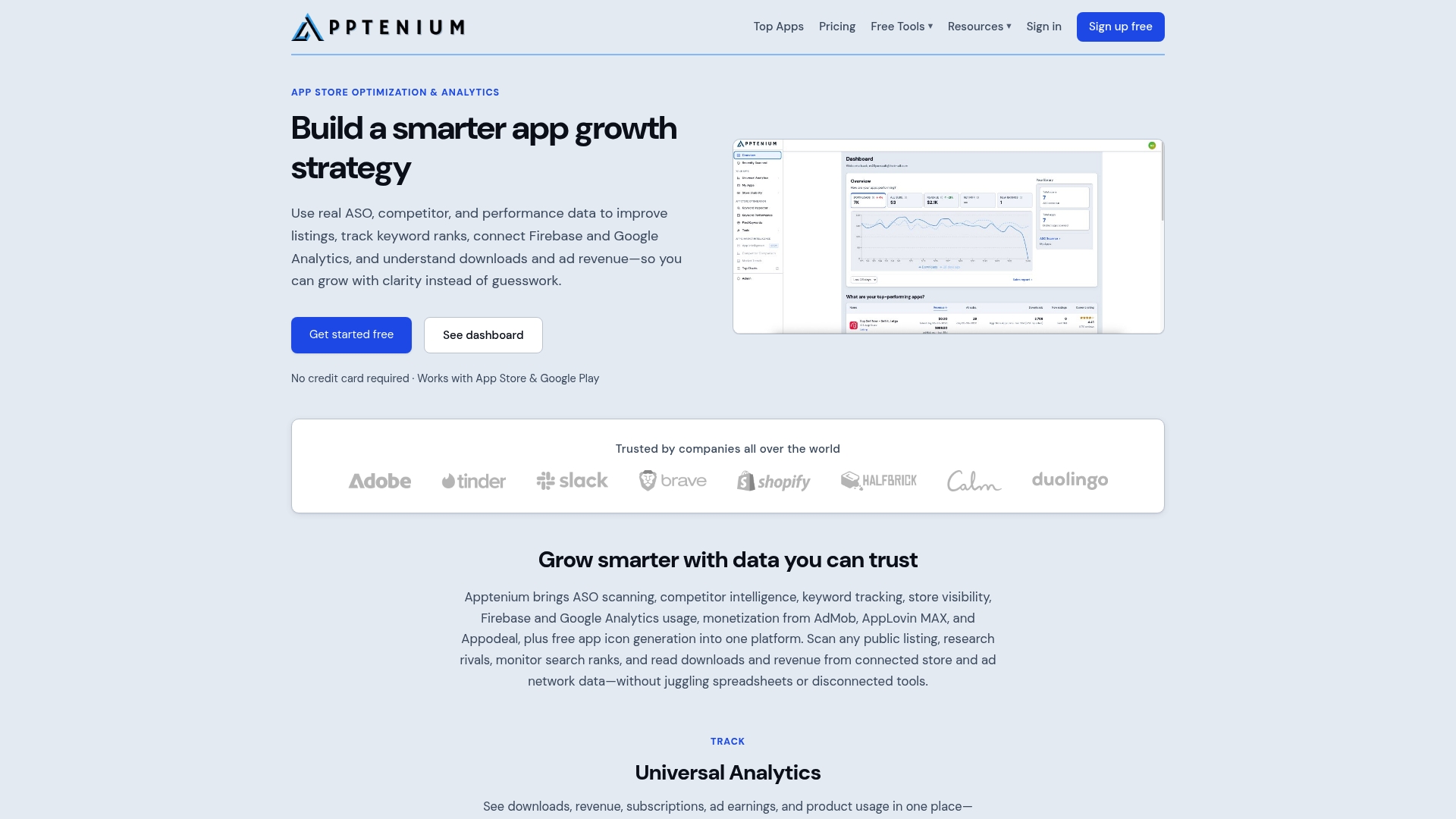
Running a color experiment is only useful if you can see how it moves your real numbers. Our ASO scanning, competitor intelligence, and keyword tracking tools support this workflow: scan your current listing, note the baseline, then swap in an icon variant and watch click-through and keyword-level performance shift from the same dashboard. Integration with Firebase and Google Analytics enables tracking of a color change beyond the store listing into install conversion and early retention, and AI recommendations flag copy-ready fixes alongside the visual test to avoid juggling separate tools for separate signals.

When brand color should lose to discoverability
Keep your brand hue when it already owns space in users’ minds. Switch to a more distinctive signature color when your category is crowded and recognition is the bottleneck. When you are unsure which situation you’re in, run the test instead of guessing.
*— Mike
Start testing your icon colors with Apptenium
Picking an icon color based on instinct alone leaves real install volume on the table, and we built our platform so you don’t have to choose between a quick gut call and a slow, scattered testing process. Run an ASO scan, layer in competitor intelligence, and watch click-through and keyword performance shift as you test icon variants, all from one dashboard connected to your Firebase and Google Analytics data.
- Start free to run your first ASO scan and baseline your current listing.
- Upgrade to Pro with details on our pricing page for unlimited scans and full AI recommendations.
- Use our free icon converter partner tool to prep multi-size icon exports before you upload variants.
Check our pricing page to pick the plan that fits your team’s testing pace.
FAQ
What is Carl Jung’s color theory?
Carl Jung associated colors with psychological archetypes and emotional states as part of his broader work on symbolism and the unconscious, rather than proposing a fixed list of universal color meanings. Modern UX color guidance borrows loosely from this idea but relies more heavily on empirical studies of how specific hues affect perception and behavior in interfaces.
What are the four psychological colors?
There is no single agreed-upon “four psychological colors” framework in design research; the idea is often a simplified pop-psychology reference rather than a scientific standard. Designers get more reliable guidance from cross-cultural color-emotion research, which maps specific hues to emotional associations with measured consistency across cultures.
What colors trigger anxiety?
High-saturation reds and certain harsh yellow tones are commonly associated with alertness or urgency, which can tip into stress when overused in dense or high-contrast layouts. Context matters more than the hue alone: a red used sparingly as an accent reads very differently than red dominating an entire icon or screen.
What color calms the human brain?
Blues and muted greens are the hues most consistently linked to calm across the cross-cultural research on color and emotion, though the effect depends on saturation and brightness as much as the hue itself. A soft, desaturated blue tends to read as calmer than a bright, saturated version of the same color.
Does icon color really affect app downloads?
Yes: icons rated as unique, aesthetically coherent, and well-designed, color included, show higher click and download intent in controlled vignette testing. The effect works through perceived quality and distinctiveness rather than any single hue being universally “better.”