Fix Install Drops in 15 Minutes a Week With an ASO Dashboard for Small Teams
Fix Install Drops in 15 Minutes a Week With an ASO Dashboard for Small Teams
An ASO dashboard consolidates keyword rankings, download and install metrics, conversion data, and review sentiment into one view, replacing spreadsheets and scattered store reports. Used correctly, it delivers four outcomes fast: clearer keyword visibility, accurate installs tracking, conversion insight across your funnel, and early warning on review trends. This guide covers the features that matter, how to act on them weekly, which integrations to connect, how to choose a tool, and why Apptenium fits SMB and startup workflows.
TL;DR:
- A comprehensive ASO dashboard should include keyword rank history with alerts, funnel metrics, benchmarking against competitors, and review sentiment analysis.
- Weekly actions should focus on flagging top-moving keywords, diagnosing conversion issues, and addressing negative review trends promptly.
- Connecting App Store Connect, Google Play Console, Firebase, and Google Analytics ensures accurate, first-party store and in-app data feeds.
- Choosing a dashboard depends on market coverage, keyword tracking depth, integration support, and cost suitability for SMBs.
- Real-time data in dashboards is limited by store reporting delays; expect fast updates once source data becomes available.
Table of Contents
- What Core Metrics Should an ASO Dashboard Show?
- How Do You Turn Dashboard Data Into Weekly Actions?
- Which Integrations Feed an Accurate ASO Dashboard?
- How Do You Choose and Configure the Right Dashboard?
- Why Apptenium Fits ASO Dashboard Needs for SMBs
- What Does User Segmentation and Cohort Analysis Add?
- How Should You Set Up Custom Reports and Alerts?
- Does Real-Time Data Actually Matter for ASO?
- What Data Privacy Rules Apply to ASO Dashboards?
- An Editorial Take on Building a Weekly Dashboard Habit
- Get Started With Apptenium’s ASO Dashboard
- Sources
- FAQ
What Core Metrics Should an ASO Dashboard Show?
A dashboard earns its keep when it turns raw store data into decisions, not just prettier charts. Five feature groups separate a genuinely useful app performance dashboard from a vanity report.
Keyword rankings and search visibility come first. You want indexed query counts, keyword position trends, and a sense of your keyword distribution across head terms versus long tail. A keyword that slips from position 4 to position 11 over ten days is a bigger signal than your average daily install count, because it usually predicts the install drop before it shows up in revenue.
The acquisition funnel ties impressions, product page views, conversion rate, and installs together. This sequence matters more than any single number: it tells you whether people are finding your listing (impressions) but not clicking (a page-view problem), or clicking but not converting (a creative or copy problem). Separating those two failure modes is the single most useful thing an ASO dashboard analytics platform does for a lean team.
Market or category benchmarking, shown as a visual comparison against category peers, helps you set realistic targets instead of guessing. A visibility comparison feature lets you see where your keyword footprint and ranking trend sit relative to the broader category, without needing a dedicated analyst to build that view manually.
Ratings, reviews, and sentiment trends round out the picture. Review volume and average rating directly influence conversion rate on both major stores, so a spike in one-star reviews after a release deserves the same urgency as a ranking drop.
Key features to check for in any dashboard:
- Keyword rank history with position-change alerts, not just a static snapshot
- Full funnel view: impressions, product page views, conversion rate, installs
- Category-level visual comparison for benchmarking visibility trends
- Review and rating feed with sentiment tagging over time
- Update or experiment timeline that maps metadata and creative changes to metric shifts
How Do You Turn Dashboard Data Into Weekly Actions?
Data without a routine just becomes noise you scroll past. The workflow below turns your dashboard into a decision engine on a weekly and monthly cadence.
- Scan top-moving keywords first. Sort by rank change over the past seven days and flag anything that moved more than five positions in either direction.
- Check the funnel for conversion drops. If impressions are flat but product page views or conversion rate fell, the issue is almost always your screenshots, video preview, or icon, not your keywords.
- Review the ratings feed for spikes. A sudden cluster of similar complaints (crashes, a broken feature, a confusing paywall) needs to reach your product team the same week, not at the next planning cycle.
- Decide: metadata refresh or creative test? If rankings are stable but conversion is soft, prioritize a screenshot or preview video A/B test. If rankings are the problem and conversion is healthy, refresh your title, subtitle, and keyword field instead.
- Log the change against the update timeline. Every metadata edit or creative swap should get a timestamp on your dashboard so next week’s review can attribute movement correctly.
A concrete example: if conversion rate drops for two straight weeks with no ranking change, that is your cue to update screenshots or your app preview video, not to chase new keywords. If review sentiment turns negative around a specific feature, escalate it as a product bug ticket, not an ASO task. This rhythm mirrors what most structured ASO audit checklists recommend: lightweight weekly checks paired with a deeper monthly or quarterly pass on keywords, creatives, and localization.
Pro Tip: Keep a simple change log next to your dashboard, even a shared doc, noting the date of every metadata or creative update. Six months in, that log becomes the fastest way to explain any ranking or conversion swing to your team without guessing.
Which Integrations Feed an Accurate ASO Dashboard?
A dashboard is only as good as what feeds it. Five sources cover most of what a marketing or product team needs.
- App Store Connect for iOS impressions, product page views, conversion rate, and download counts
- Google Play Console for the Android equivalent, including store listing experiments
- Firebase for in-app events, retention cohorts, and crash data tied to specific app versions
- Google Analytics for cross-channel attribution when traffic arrives from outside the store search
- Ad network dashboards for paid install volume, so you can separate organic lift from paid spend
Connecting App Store Connect and Google Play Console from day one gives you first-party accuracy on impressions, views, and conversion rate. That precision matters because third-party keyword-rank estimates, while useful for trend direction, carry sampling assumptions the store consoles do not. Store data also lags by a day or two in some regions, so treat same-day numbers as provisional and trust the seven-day trend line over any single day’s read. Combining store metrics with Firebase and analytics data is what reveals whether an install actually retains, which a raw download count never tells you on its own.
How Do You Choose and Configure the Right Dashboard?
Picking a tool comes down to fit, not feature count. Match the dashboard to your team size, your markets, and how often you actually plan to act on the data.
Evaluate any candidate against these criteria:
- Market coverage: does it track your actual launch countries and app stores, not just the US and UK?
- Keyword depth: how many tracked keywords are included before you hit a paid tier?
- Experiment support: can it log A/B test results against metadata changes automatically?
- Reporting and alerts: can you set custom thresholds instead of checking manually every day?
- Integration breadth: does it connect Firebase, Google Analytics, and ad networks natively?
- Pricing fit: does the cost scale sensibly for an SMB budget, or does it assume enterprise headcount?
Once you pick a tool, set configuration defaults immediately: baseline KPIs for conversion rate and keyword rank, benchmark targets pulled from your category comparison view, defined user roles so nobody accidentally edits live metadata, and alert thresholds tight enough to catch a real drop without paging you over normal daily noise. Most pre-launch ASO checklists recommend building this configuration four to six weeks before release, so tracking is live the moment your listing goes public.
Pro Tip: Before signing a contract, ask the vendor exactly how many keywords and competitor apps are included at your plan tier. Keyword-count limits are the most common surprise SMBs hit after their first month.
Why Apptenium Fits ASO Dashboard Needs for SMBs
Apptenium was built around the exact workflow described above: fewer tools, clearer signals, faster action. Rather than asking a small team to stitch together a rank tracker, a review monitor, and a separate analytics export, it puts those pieces in one workspace.
- AI-powered recommendations flag metadata and creative issues automatically, so you are not manually cross-referencing every metric drop
- Keyword tracking and rank history sit alongside competitor intelligence for category-level visual comparison
- Native integrations pull in Firebase and Google Analytics data alongside App Store Connect and Google Play Console
- A single-pane view reduces the fragmented-analytics problem that forces teams to reconcile three exports before a Monday standup
Real outcomes from teams using this approach are documented on the Apptenium customer stories page, which shows how combining store data with analytics and ad network inputs improves attribution clarity for lean teams without a dedicated data analyst.
What Does User Segmentation and Cohort Analysis Add?
Aggregate metrics hide the differences that actually matter.
Segmentation typically splits users by acquisition source (organic search, paid, referral), geography, device type, or app version. Cohort analysis then tracks how each group behaves over time, not just at the moment of install. Retention curves are the clearest use case: comparing the 7-day and 30-day retention of users who installed after your last screenshot update against those who installed before tells you whether that creative change actually improved user quality, or just increased raw volume.
For app marketers, the practical value shows up in three places. First, geographic cohorts reveal whether a localization effort is paying off in a specific market rather than averaging out across your whole user base. Second, version cohorts show whether a recent app update improved or hurt retention, which matters more than any single install spike. Third, channel cohorts separate organic ASO wins from paid campaign effects, which keeps your team from crediting a keyword refresh for growth that a Facebook campaign actually generated.
Not every dashboard supports deep cohort analysis, and for a small team it is often a lower priority than solid funnel and keyword tracking. But once your install volume grows past a few hundred a day, segmented retention data becomes the difference between guessing why growth stalled and knowing exactly which cohort caused it.
How Should You Set Up Custom Reports and Alerts?
Nobody wants to open five tabs every morning to check if anything broke overnight. Configurable alerts exist to make that unnecessary.
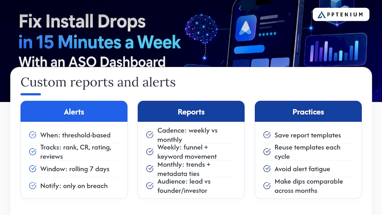
Set alerts around the metrics that actually predict trouble: a keyword rank drop past a defined threshold, a conversion rate decline of more than a few percentage points over a rolling seven-day window, a rating average that dips below a set floor, or a sudden cluster of negative reviews within a short window. Threshold-based alerts beat daily manual checks because they only interrupt you when something is actually wrong, not every time a number moves slightly.
Custom reports matter for a different reason: communication. A weekly automated report sent to a product lead should look different from a monthly summary sent to a founder or investor. The weekly version needs granular funnel numbers and keyword movement. The monthly or quarterly version should roll up trends, tie changes to specific metadata or creative updates on your timeline, and translate ranking movement into installs and revenue language a non-ASO stakeholder actually cares about.
Build report templates once, save them, and reuse them rather than rebuilding a view from scratch every cycle. That habit alone saves most small teams several hours a month, and it keeps reporting consistent enough that a rank dip in March is genuinely comparable to a rank dip in July. Alert fatigue is the real risk here: if every minor fluctuation triggers a notification, your team will start ignoring alerts entirely, which defeats the purpose of setting them.
Does Real-Time Data Actually Matter for ASO?
Real-time is a relative term in app store analytics, and it is worth being honest about what “real-time” actually means before you pay extra for it. Store consoles themselves often have a reporting lag of a day or more for certain metrics, so a dashboard claiming true real-time updates is usually referring to how fast it refreshes once the store makes data available, not a live feed the moment a user installs your app.
That distinction matters practically. Keyword rank checks typically run once or twice daily, which is frequent enough to catch meaningful movement without generating noise from hourly fluctuation. Conversion and installs data, pulled from App Store Connect and Google Play Console, generally reflects the store’s own reporting schedule rather than true instant capture. What you should actually expect from a well-built dashboard is fast processing once source data lands: minimal delay between the store publishing a number and your dashboard displaying it, paired with a dashboard interface that loads quickly even when you are tracking hundreds of keywords across multiple markets.
Dashboard performance under load is a separate but related concern. A tool that tracks a large keyword set across several countries needs to render trend charts and comparison views without lag, or your weekly review turns into a waiting game. If you are evaluating a tool, load a full month of data across your top markets during a trial and see how the interface actually holds up, not just how fast the demo loads with a handful of sample keywords.
What Data Privacy Rules Apply to ASO Dashboards?
Connecting App Store Connect, Google Play Console, Firebase, and ad network accounts to a third-party dashboard means handing over API access to systems that touch user-level data, even when the dashboard itself only displays aggregated metrics. That access relationship deserves the same scrutiny you would give any vendor touching sensitive systems.
Check how a vendor handles credentials first. API keys and OAuth tokens for your store consoles should be stored encrypted, and a reputable dashboard tool will support scoped, revocable access rather than requiring your full account password. Ask specifically whether the tool needs read-only access or broader permissions than your reporting use case actually requires.
Regional compliance frameworks add another layer. If your app serves users in the European Union, aggregated analytics tied back to identifiable users may fall under GDPR obligations, and your dashboard vendor’s own data handling needs to align with those rules, not just your app’s. California’s privacy statutes create similar obligations for apps serving residents there. These rules govern the underlying user data your analytics are built from, not just the dashboard’s reporting layer, so due diligence on a vendor’s compliance posture belongs in your procurement checklist, not as an afterthought after signing.
Finally, ask where data is stored and for how long. A vendor that retains raw keyword and performance history indefinitely without a clear retention policy is a bigger long-term risk than one that is upfront about deletion timelines and data residency.
An Editorial Take on Building a Weekly Dashboard Habit
The teams that get the most out of an ASO dashboard are not the ones with the most metrics turned on. They are the ones who protect fifteen minutes a week to actually look at the data with intent. Skim rank movers first, check the funnel for a conversion break, scan reviews for a repeating complaint, and stop. That is the whole review. Anything longer usually means you are browsing, not deciding.
Most teams overweight keyword rank and underweight the funnel breakdown between impressions, page views, and installs. Rank tells you if people can find you. The funnel tells you if your listing actually convinces them once they arrive, and that second question is usually where the real revenue sits. A dashboard that makes that funnel visible at a glance is worth more than one with a longer keyword list and a buried conversion chart.
The other habit worth building: treat every review spike as product feedback before you treat it as an ASO metric. A rating drop is rarely fixed by better screenshots if the underlying complaint is a bug.
— Mike
Get Started With Apptenium’s ASO Dashboard
Apptenium brings the exact workflow this guide describes into one workspace: keyword tracking, funnel metrics, category benchmarking, and AI-powered recommendations, all pulling from App Store Connect, Google Play Console, Firebase, and Google Analytics without the manual reconciliation most small teams end up doing across separate tools.
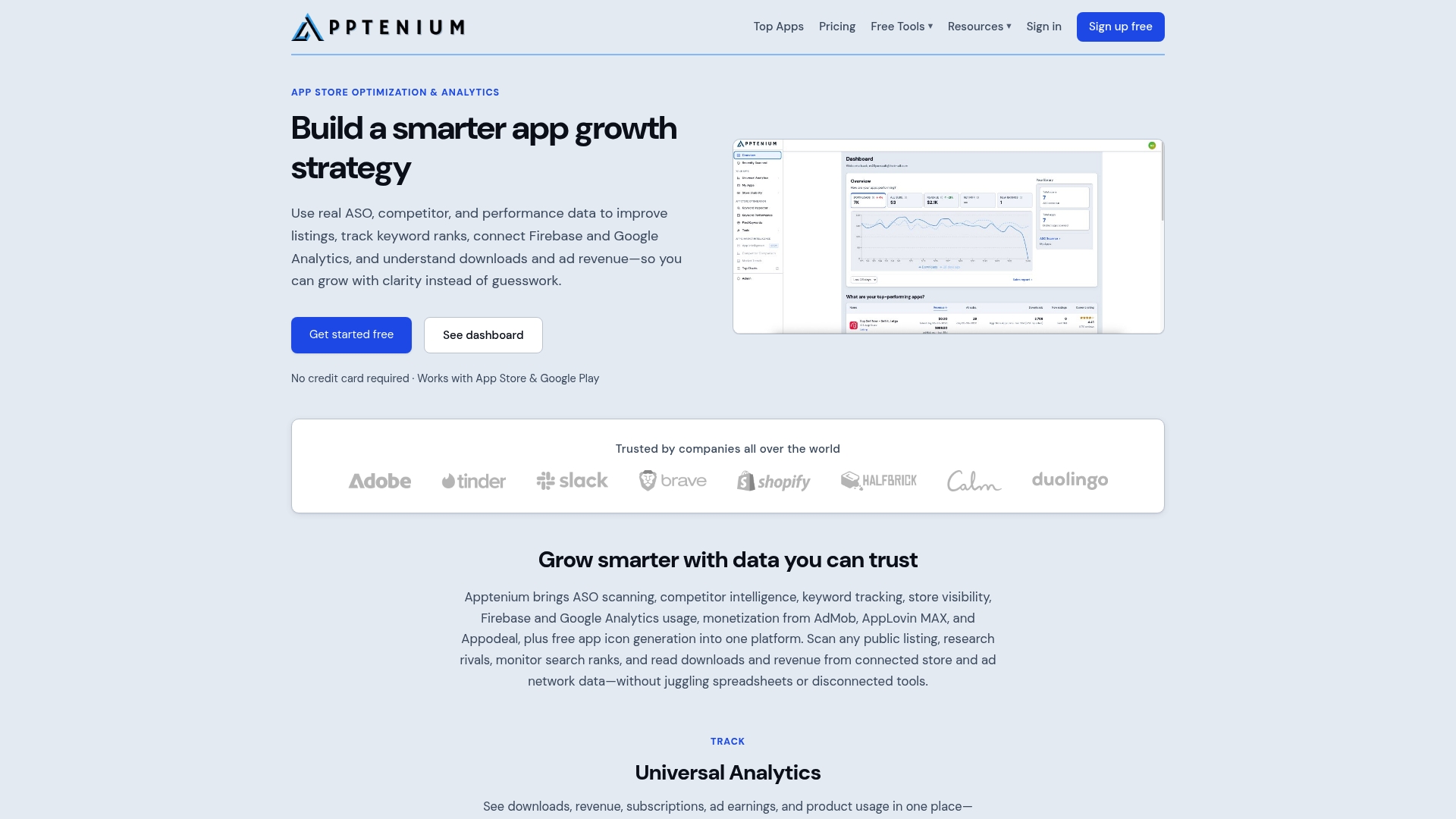
If your team is currently checking three or four dashboards to answer one question about why installs dropped last week, that is the fragmented-analytics problem Apptenium was built to remove. The free tier gives you a limited number of scans a month, enough to see how keyword tracking, review monitoring, and the AI recommendations work against your actual listing before committing to anything. For a closer look at how the platform stacks up against alternatives for SMB and startup budgets, the comparison breaks down feature and pricing fit directly. Start with a free scan of your current listing, or check the feature overview to see exactly which integrations and reporting tools come with each plan before you request a demo.
Sources
- ASO Checklist: 30 Steps to Optimize Your Listing | AppDrift
- ASO Dashboard – Comparison of App Visibility with Competitors
FAQ
What Is an ASO Dashboard Used For?
An ASO dashboard tracks keyword rankings, the impressions to installs funnel, conversion rate, and review sentiment in one view, so app marketers can spot ranking or conversion problems without pulling separate exports from each store console.
How Often Should I Check My ASO Dashboard?
Do a focused weekly review of top-moving keywords, funnel metrics, and review spikes, then run a deeper monthly or quarterly audit covering metadata, creatives, and localization.
Which Integrations Matter Most for an ASO Dashboard?
App Store Connect and Google Play Console are essential for first-party impressions, views, and conversion data, while Firebase and Google Analytics add retention and cross-channel attribution context.
Does Apptenium Support Competitor Benchmarking?
Yes. Apptenium includes competitor intelligence and category-level visual comparison, letting you benchmark your keyword footprint and visibility trends against the broader market without manual tracking.
Is Real-Time Data Realistic for App Store Metrics?
Not in the literal sense. Store consoles themselves report certain metrics with a lag of a day or more, so a well-built dashboard should aim for fast processing once data lands rather than promising instant, live capture.