Cohort Retention Analysis: A 2026 Practitioner's Playbook

Cohort retention analysis shows exactly when users leave and what kind of fix they need. Build your cohort grid first, inspect the early months for cliffs versus flattening, then commit to one testable hypothesis before touching anything else. That sequence matters because cohort analysis groups users by a shared start event and tracks them over time, exposing the retention curves that blended averages permanently hide. Two trust signals to keep front of mind: the cohort grid itself (your primary diagnostic artifact) and LTV, which you cannot estimate reliably without stable cohort curves. And before you redesign onboarding for an early cliff, check your payment-failure logs. In many subscription models, involuntary churn accounts for a substantial share of early churn, and a recovery flow often fixes it faster than any product change.
Table of Contents
What cohort retention analysis is and why it beats blended retention
How to run cohort retention analysis: a step-by-step methodology
Apptenium connects your cohort data to the full acquisition picture
What cohort retention analysis is and why it beats blended retention
Blended retention is a single number that averages every user you have ever acquired. It feels clean, but it lies. A product with strong 2022 cohorts and collapsing 2025 cohorts can still report a healthy blended rate while the business quietly deteriorates.
Cohort retention analysis fixes that by isolating groups of users who share a start event, typically signup or first install, and tracking what percentage of each group remains active in each subsequent period. The technique reveals cohort-specific curves that blended metrics permanently obscure, letting you see whether your product is getting better or worse for the people you are acquiring right now.
The business value breaks down into four concrete benefits:
Trend detection: — Comparing cohort curves over time shows whether product or acquisition changes are actually improving retention, not just inflating signup volume.
LTV grounding: Cohort curves define average user lifespan, which is the foundation for reliable LTV estimates and LTV-to-CAC decisions.
Cohort types and when to use each
Picking the wrong cohort type for your question wastes weeks of analysis. The three types in regular use each answer a different question.
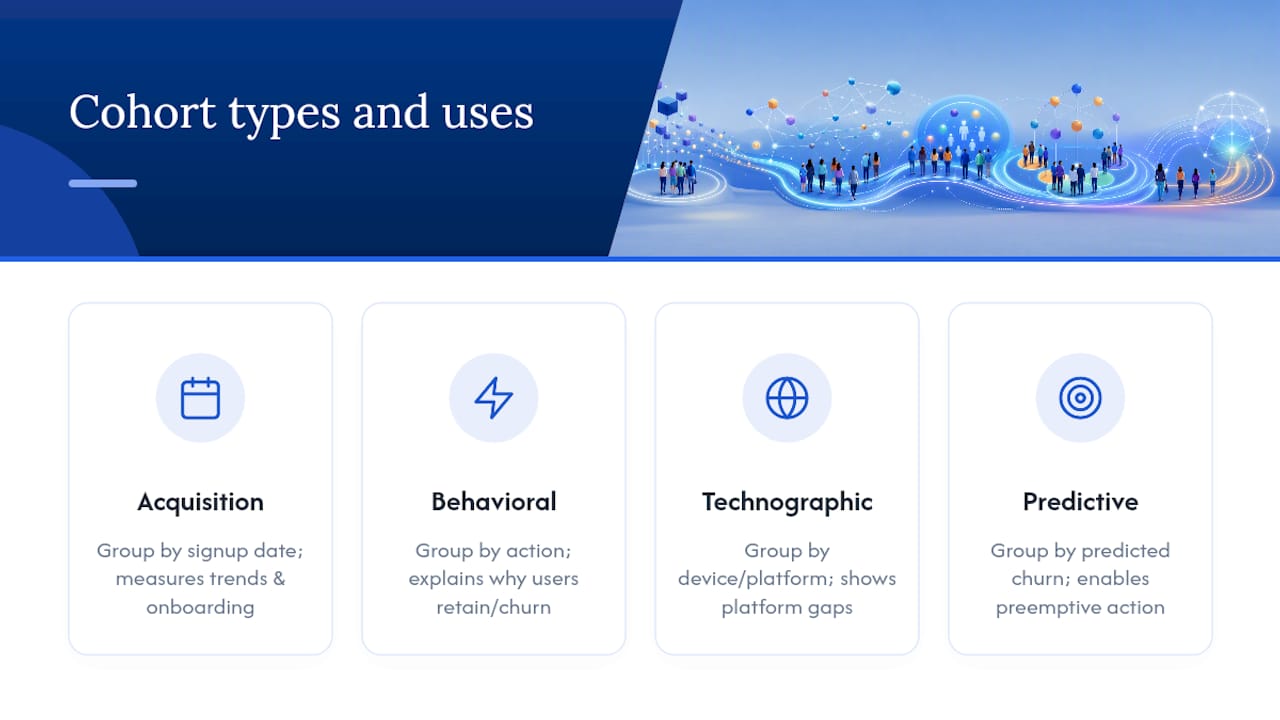
Acquisition cohorts group users by when they joined, usually by signup week or month. Use these when your question is about trends over time or onboarding effectiveness. If you want to know whether the new onboarding flow you shipped in March improved month-1 retention compared to February, acquisition cohorts give you the answer directly.
Behavioral cohorts group users by an action they took, such as completing a tutorial, connecting an integration, or hitting a usage threshold. Acquisition cohorts show when users churn; behavioral cohorts help explain why. When you suspect that users who reach a specific “aha moment” retain at dramatically higher rates, behavioral cohorts confirm or refute that hypothesis.
Technographic or segment cohorts group users by device type, platform, geography, or acquisition channel. These are most useful when you suspect performance or experience differences are driving retention gaps. A mobile app that retains iOS users at 55% and Android users at 32% at month 3 has a platform problem, not a product problem.
Predictive cohorts are worth adopting once you have enough signal volume and a working ML pipeline. They group users by predicted churn probability, letting you intervene before the drop happens rather than analyzing it afterward.
How to calculate cohort retention
The formula is straightforward:
Cohort retention rate = (users active in period N ÷ original cohort size) × 100
For a concrete example: your January cohort starts with 200 users. At month 1, 140 are still active, giving you 70% month-1 retention. At month 3, 150 of the original 200 are active, giving you 75% month-3 retention. (Month-3 retention can exceed month-1 retention in some products if users who went dormant reactivate, which is worth flagging in your notes column.)
Before you run the formula, you need to define “active.” Logging in is the weakest possible definition. A user who opens your app once and never completes a meaningful action looks retained by login data but is effectively churned. Picking a key action, such as a revenue event, a core feature use, or a subscription renewal, changes what the curve actually measures and therefore what it diagnoses.
The sample cohort grid below is formatted for Google Sheets or any BI tool. Rows are monthly cohorts; columns are months since signup.
CohortSizeMonth 1Month 2Month 3Month 6Jan20070%—75%—Feb——58%——Mar—72%———
Dashes in later columns indicate right-censored periods: those cohorts have not yet reached that observation window, so the cells stay empty rather than showing misleading zeros.
How to run cohort retention analysis: a step-by-step methodology
A reliable cohort report depends on clean inputs before it depends on any analytical technique. A robust data pipeline and consistent event definitions are prerequisites for accurate cohort reports. Here is the operational checklist:
Define the active event — Choose a meaningful action, not a login. Document this definition and freeze it before you run any analysis. Changing it mid-analysis invalidates comparisons.
Apply sample-size discipline. Analyze at least four to six cohorts before drawing trend conclusions, and treat any cohort smaller than roughly 100 users as directional only. Small cohorts produce noisy signals that look like trends but are not.
Logistic decay models and likelihood-ratio tests give you a formal way to quantify per-period decay and test whether two cohort trajectories differ statistically, which is worth adding once your team is comfortable with the basics.
Action playbook: what to test for each curve shape
Translating a curve shape into a prioritized experiment is where most teams stall. Here is the mapping:
Cliff in early periods (activation problem):
Run activation experiments: shorten time-to-first-value, add contextual onboarding prompts, test trial-to-paid gating changes.
Check payment-failure logs first and deploy a recovery flow if involuntary churn is elevated.
Leading metrics to track: activation rate, Day 7 retention, Day 30 retention.
Steady decay (sustained value problem):
Test feature nudges that surface underused high-value functionality.
Experiment with habit-building mechanics: streaks, weekly digests, or progress indicators.
Review pricing and packaging to see whether users are hitting a ceiling before they see enough value to renew.
Leading metrics: weekly active users per cohort, feature adoption funnel, upgrade rate.
Flattening at a low level (acquisition quality or LTV problem):
Shift acquisition budget toward channels whose cohorts flatten at higher levels.
Run cohort-by-channel tests to isolate which sources bring durable users.
Focus on ARPU expansion for the retained core: upsell, cross-sell, or seat expansion.
Leading metrics: cohort LTV-to-CAC ratio, upgrade rate, ARPU per cohort.
Cross-cutting interventions that apply to all three shapes:
Build a payment-recovery flow (dunning emails, card-update prompts) as a baseline for any subscription product.
Run re-engagement campaigns for mid-life dips, targeting users who were active in earlier periods but have gone quiet.
Fix instrumentation gaps before running A/B tests. A test built on incomplete event data produces conclusions you cannot trust.
When a leading indicator moves in the right direction after two to three weeks, escalate from a quick A/B test to a full product change. When it does not move, kill the experiment and try the next hypothesis on your list.
Recommended tooling and a practical workflow for app teams
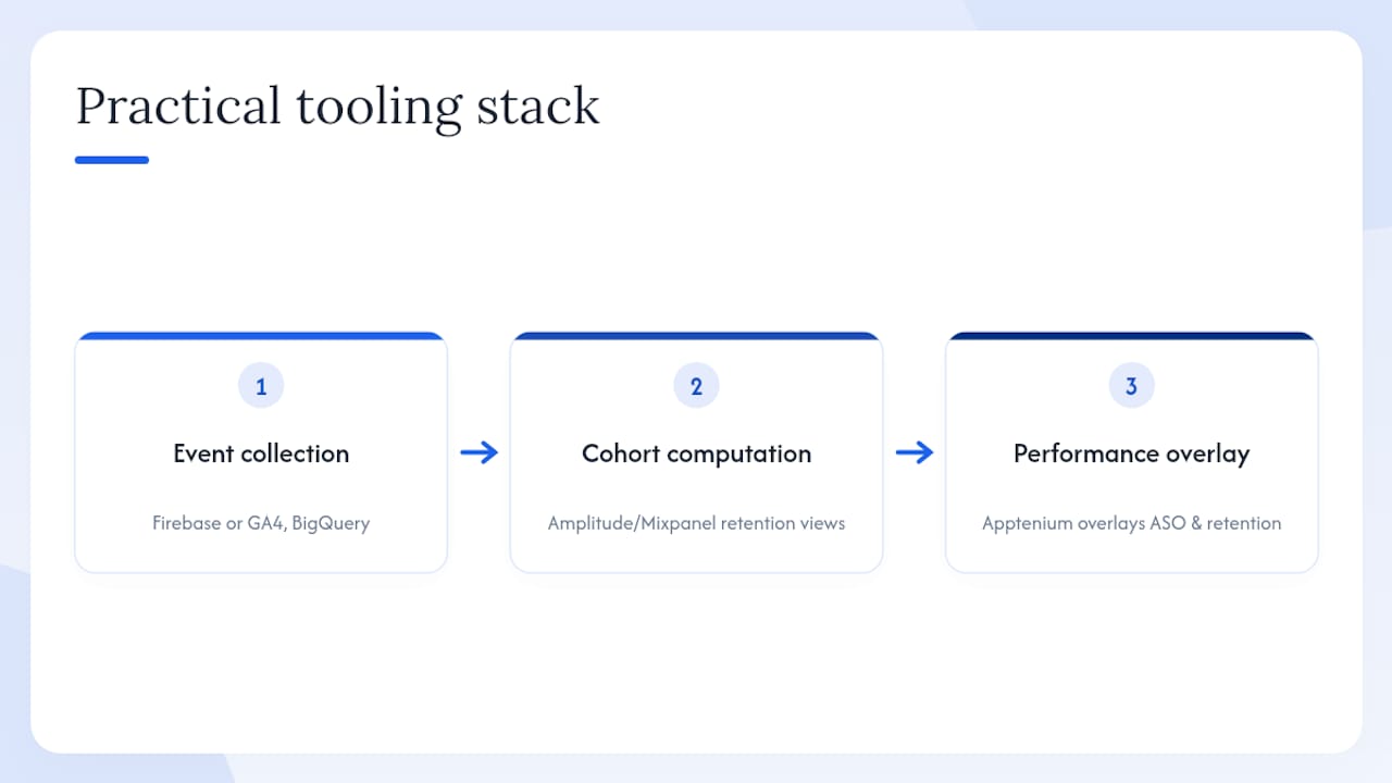
The practical stack for most mobile app teams has three layers: event collection, cohort computation, and performance overlay.
Layer 1: Event collection. Firebase or Google Analytics 4 handles event tagging for most mobile apps. Tag your cohort-defining event (first install or first open), your active event (core feature use or subscription renewal), and your payment-failure event as three distinct log entries. Export raw events to BigQuery for cohort computation.
Layer 2: Cohort computation and visualization. Amplitude and Mixpanel are the two most common behavioral analytics platforms at this layer. Both offer built-in cohort retention views, funnel analysis, and experimentation modules. They sit between your raw event stream and your decision-making, translating event data into the retention grids and curves described in this article.
Layer 3: Performance overlay and ASO signal integration. This is where Apptenium fits. Apptenium ingests data from Firebase and Google Analytics, then overlays app-store performance signals, including keyword rankings, install conversion rates, and competitor movements, alongside your retention metrics. The result is a single view that connects acquisition quality (which keywords and store listings brought which cohorts) to downstream retention. Apptenium’s AI-powered recommendations flag when a listing change or keyword shift is likely driving a cohort quality change, which is a signal most pure behavioral analytics tools miss entirely.
Pro Tip: Schedule nightly backfills for your cohort tables. Events that arrive late due to offline sessions or delayed attribution can silently undercount early-period retention. A nightly job that reprocesses the last 72 hours of events keeps your cohort grid accurate without manual intervention.
Set up alerting on cohort deviations: if month-1 retention for the current cohort drops more than a defined threshold below the trailing three-month average, trigger a Slack or email alert before the next weekly review.
A copyable cohort-retention report template
The template below is ready to paste into Google Sheets or Excel. Add conditional formatting with a color scale (green for high retention, red for low) to turn the grid into a heatmap that makes cliffs and trends visible at a glance.
Column definitions:
ColumnFormula / SourceCohort label“Jan 2026”, “Feb 2026”, etc.Signup date rangeFirst and last signup date in the cohortCohort sizeCOUNT(DISTINCT user_id) WHERE cohort = labelMonth-1 retentionActive users in month 1 ÷ cohort size × 100Month-3 retentionActive users in month 3 ÷ cohort size × 100Month-6 retentionActive users in month 6 ÷ cohort size × 100NotesFlags: involuntary churn spike, product release, campaign
Sample dataset to paste and extend:
CohortDate RangeSizeM1 %M3 %M6 %NotesJan 2026Jan2007075—BaselineFeb 2026Feb————New onboarding A/BMar 2026Mar—72——Onboarding v2 liveApr 2026Apr 1–30————Right-censored M3+May 2026May————Right-censored M3+
Red-flag thresholds to apply immediately:
Month-1 retention below 40% for a freemium app: flag as a critical activation problem.
Early involuntary churn above 20%: route to payment recovery before any product experiment.
Month-3 retention declining across three consecutive cohorts: escalate to a product review.
Common pitfalls and how to avoid false conclusions
The most expensive mistake in cohort work is acting on a signal that was never real. These are the pitfalls that produce false conclusions most often.
Relying on blended metrics alongside cohort data. Once you have cohort curves, blended retention becomes a lagging vanity metric. Teams that report both often end up defending the blended number when cohort trends are already negative.
Mixing cohort start events. If some users are cohorted by signup and others by first purchase, your grid is comparing two different populations. Standardize the start event before you run a single query.
Small cohorts and noisy signals. A cohort of 30 users that shows 80% month-3 retention is not a product win. It is noise. Require a minimum cohort size before treating any result as directional, and never act on a single cohort’s data in isolation.
Ignoring right-censoring. Recent cohorts have not aged enough to show later-period retention. Treating their empty cells as zeros produces a false downward trend in your most recent data.
AI-era traffic contamination. In 2026, automated traffic and AI-driven sessions can inflate early engagement signals without contributing to genuine retention. Apply user-quality filters, such as minimum session depth or first meaningful action completion, before including sessions in your cohort definitions. Flag cohorts formed during periods of unusual traffic spikes for separate review.
Best practices that prevent these errors: standardize your event definitions in a shared data dictionary, document the minimum cohort size your team requires before acting, run cohort-by-channel checks monthly, and validate quantitative findings with qualitative user research at least once per quarter.
Key Takeaways
Cohort retention analysis is the most direct path from user behavior data to prioritized product decisions, because it separates when users leave from how many leave and maps each timing pattern to a specific class of fix.
PointDetailsDiagnose before you actRead the curve shape first: cliff, steady decay, or flattening each points to a different intervention.Check payment failures firstInvoluntary churn accounts for 20–40% of early churn; a recovery flow often resolves cliffs faster than an onboarding redesign.Require minimum cohort sizeTreat cohorts smaller than roughly 100 users as directional only; analyze at least four to six cohorts before drawing trend conclusions.Tie cohorts to LTVStable cohort curves are the foundation for reliable LTV estimates and LTV-to-CAC budget decisions.Use Apptenium for mobile app teamsApptenium overlays Firebase and Google Analytics cohort data with ASO signals, connecting acquisition quality to downstream retention in one view.
The signal most product teams read too late
The conventional wisdom says to fix retention by improving the product. That is usually right, but it is also the most expensive hypothesis to test. What I see repeatedly is teams spending two sprints rebuilding onboarding flows for a cliff that turns out to be a billing problem. The cohort grid showed the cliff clearly. The payment logs, which nobody checked, showed the cause just as clearly.
The more useful discipline is to treat the cohort grid as a triage tool, not a project brief. When a cliff appears, the first question is not “what do we build?” It is “what do we rule out?” Payment failures, attribution errors, and bot traffic can all produce curve shapes that look like product problems. Rule those out in a day. Then build.
The second thing teams underestimate is the column-reading direction. Most analysts read across rows, watching a single cohort age. Reading down columns, comparing the same period across successive cohorts, is where you catch trends early. If month-1 retention has declined for three consecutive cohorts, you have a trend. If it declined once, you have noise. That distinction determines whether you escalate to a product review or wait one more month.
Apptenium connects your cohort data to the full acquisition picture
Most behavioral analytics tools stop at the event stream. They tell you what users did inside your app, but they cannot tell you whether the keyword that drove the install, or the store listing that converted the click, is responsible for the cohort quality you are seeing. That gap is where Apptenium operates.

Apptenium pulls in your Firebase and Google Analytics event data, generates cohort retention views alongside your ASO performance metrics, and applies AI-powered recommendations that connect listing changes, keyword shifts, and competitor movements to the retention signals in your cohort grid. If a new keyword cluster is bringing in users who churn at month 1 at twice the rate of your organic baseline, Apptenium surfaces that before you scale the campaign further. The free tier gives you immediate access to ASO scanning and app performance reporting. Paid plans unlock unlimited scans, full cohort-overlay reporting, and priority AI recommendations. Start with a free scan at Apptenium and see which acquisition signals are shaping your current cohort curves.