Feature Graphic Design for Mobile Apps: Tools, Templates & Play-Ready Checklist
Your Google Play feature graphic is a 1024×500 px banner, exported as JPEG or 24-bit PNG with no alpha channel, that appears at the top of your app’s store listing and across promotional surfaces. To create a Play-ready file right now: open your design tool, set the canvas to 1024×500 px, keep all critical content inside the central ~820×400 safe zone, and export a flat JPG. Upload it directly in Play Console under “Store presence > Main store listing > Graphics.”
Canvas size: required to be 1024×500 pixels, exactly
Format: must be JPEG or 24-bit PNG without alpha or transparency
Safe zone: recommended to keep logos, headlines, and key visuals within the central approximately 820×400 pixels
Content rules: avoid using device frames, ranking badges, or promotional pricing text
Key Takeaways
A Play-ready feature graphic requires the right specs, a single focal point, and a post-upload measurement plan to know whether it’s working.
PointDetailsExact spec is non-negotiableExport at 1024×500 px as JPEG or 24-bit PNG with no alpha channel.Safe zone protects critical contentKeep logos, headlines, and focal visuals inside the central ~820×400 area to prevent cropping.One focal point converts betterA single benefit statement and one hero visual outperform cluttered compositions at thumbnail scale.A/B test before committingTest headline vs. no headline and photo vs. illustration; track listing CTR and install rate per view.Apptenium ties assets to analyticsUse Apptenium to generate Play-ready icons, scan listing metadata, and measure creative impact in one platform.
Table of Contents
Where can you download ready-made feature graphic templates?
Apptenium connects your feature graphic to your full ASO workflow
What does the feature graphic actually do on Google Play?
The feature graphic is your app’s cover photo, video thumbnail, and promotional placement image, all in one asset. When a user lands on your store listing, this banner is the first visual they see, before screenshots, before the description, before anything else. Think of it as a storefront billboard: marketing practitioners consistently describe it as a high-value conversion asset that should communicate a single clear value proposition and prompt video plays when a promo video is present.
Google Play surfaces the feature graphic in several places:
Store listing header: the primary placement, displayed at the top of your app page
Search results and editorial collections: shown when your app appears in curated lists or category features
Google app campaigns and external sharing previews: used as the default image when your listing link is shared
Promotional video cover: if you upload a promo video, the Play button overlays your feature graphic as the thumbnail
That last point matters for your design. When a promo video is attached, a large play button sits centered over the graphic. If no video is present, the graphic displays without any overlay, but it may not appear on all surfaces the same way. Either way, your focal content needs to survive both scenarios.
What are the exact Google Play specs for a feature graphic?
Play Console documentation specifies the requirements precisely. There is no flexibility on dimensions or format.
SpecRequirementDimensions1024×500 pxFile formatJPEG or 24-bit PNGAlpha channelNot allowed (flatten all layers)Safe zone for critical contentCenter ~820×400 pxAlt textRecommended; ≤140 characters
Safe-zone guidance: Google Play dynamically crops and scales the banner across varied surfaces. Design practitioners recommend treating the outer 10% on each edge as bleed only. Place your logo, headline, and hero image inside the central ~820×400 area to prevent clipping.
Accessibility: Play Console strongly recommends adding descriptive alt text for every preview asset. Keep it under 140 characters, skip “photo of” or “image of” phrasing, and describe what the graphic communicates. A strong example: “Calm meditation app: serene forest background with ‘Find your focus’ headline and app logo centered.”
Policy note: Google Play explicitly prohibits ranking claims, award badges, promotional pricing, and “Best of” language in preview assets. Including them risks automated rejection or reduced eligibility for curated placements.
Which tools help you build a Play-ready feature graphic?
Four main tool types cover most workflows: AI-assisted generators (fast, template-driven), design community galleries (inspiration and downloadable concepts), integrated ASO platforms (asset creation tied to analytics), and traditional design tools like Figma or Adobe Photoshop with community templates. The right choice depends on how much customization you need and whether you want your creative assets connected to performance data.
ToolPriceTemplatesEase of useExport / Play-readyCustomizabilityAppteniumFree tier + paidIcon generator + ASO asset toolsIntegrated workflow; no design tool requiredPlay-ready export with ASO analyticsASO-linked; icon and listing assetshotpot.aiFree + paid tiersAI-generated templates for Play graphicsOne-click AI generationJPG/PNG at 1024×500Limited layer control; fast editsDribbbleFree to browse; paid for some filesCommunity shots, concept files, PSD/FigmaInspiration gallery; requires design tool to adaptVaries by file; adapt to Play specs manuallyHigh; source files editable in Figma/PSD
Apptenium suits teams that want asset creation and ASO performance in one place. You can generate Play-ready icons, scan your listing metadata, and track keyword rankings without switching platforms.
hotpot.ai is the fastest path from zero to a drafted graphic. Its AI templates generate a 1024×500 composition in seconds, which works well for rapid iteration or early-stage testing before investing in polished design.
Dribbble is the right starting point when you want to study what high-quality feature graphics look like before building your own. The community tag page surfaces real designer work across categories, and many posts include downloadable Figma or PSD files you can adapt. The trade-off: you still need a design tool to resize, localize, and export to Play spec.
How do you design a feature graphic that actually converts?
The single most reliable principle, confirmed across multiple practitioner guides, is one benefit and one focal point. Every element beyond that competes for attention and reduces readability at thumbnail scale.
What to do:
Lead with your app’s clearest value proposition in five words or fewer
Keep your color palette consistent with your app icon and UI
Use high contrast between text and background so the headline reads at 25% zoom
Place your logo or icon inside the safe zone, not at the edges
Design with the play-button overlay in mind: leave the center-left or center-right clear for text if a video is attached
What to avoid:
Device mockups and screenshot crops (they clutter the composition and shrink the readable area)
More than one short headline or more than two text elements total
Ranking claims, “#1 app,” award badges, or promotional pricing
Mismatched color schemes that clash with your icon or screenshots
Alpha channels or semi-transparent layers in the exported file
Pro Tip: Before finalizing, overlay a semi-transparent play button centered on your graphic and check whether your headline and logo still read clearly. If the overlay occludes your key message, shift the text left or right. This single QA step prevents the most common composition mistake for apps with promo videos.
A/B test ideas to measure impact:
Headline vs. no headline: run both variants and watch listing CTR over two weeks
Hero photo vs. abstract/illustrated background: track install rate per listing view
Icon included vs. icon absent: measure whether brand recognition lifts or the extra element creates clutter
StoreShots’ export workflow guidance recommends previewing your exported file at 25% and 12.5% before uploading. If the focal visual and headline hold at those sizes, the graphic will read across every Play surface.
What do successful feature graphic approaches look like?
Real-world feature graphics cluster into a few repeatable patterns. Each has a clear logic and a specific failure mode worth testing against.
Hero photo + logo (e.g., weather or travel apps): A full-bleed atmospheric photo with the app logo centered and a short tagline below. Works because the image communicates the app’s world instantly. Test: swap the tagline for a benefit statement (“Know before you go”) and watch whether CTR shifts.
Lifestyle split (e.g., fitness or wellness apps): A person in context on one half, the app name and a short benefit on the other. The Incipia multi-example analysis cites 8Fit as a strong example of this approach. Risk: if the lifestyle image is generic stock photography, it reads as untrustworthy. Test: replace stock with a real-use screenshot crop and compare install rates.
Brand banner (e.g., social or messaging apps): Solid brand color, centered logo, minimal or no text. Bumble uses this pattern effectively. It relies entirely on brand recognition, so it works best for apps with an established audience. Test: add a one-line benefit statement and measure whether new-user CTR improves.
Single bold illustration: A custom illustration that represents the app’s core use case, no photography. Strong for games and creative tools. The risk is that illustration quality varies widely; a low-fidelity version signals low production value. Test: compare a polished illustration against a photo-based variant to see which drives more video plays.
Pro Tip: Treat the feature graphic as a thumbnail first and a banner second. If you cannot identify the focal point in under two seconds, the composition needs simplification, not more elements.
Export and upload checklist before you go live
Run through this before every Play Console upload.
Set canvas to 1024×500 px in your design tool before starting, not after.
Flatten all layers and remove any alpha or transparency.
Export as JPEG (quality 90–95%) or 24-bit PNG with no transparency.
Check file size: keep JPG under 1 MB and PNG under 2 MB for fast loading.
Preview at 25% zoom to confirm the headline and focal visual read clearly.
Overlay a centered play button (semi-transparent) and verify no critical content is occluded.
Name the file descriptively: e.g.,
appname-feature-graphic-en-1024x500.jpg.Write alt text (≤140 characters, no “image of” phrasing) before uploading.
Upload in Play Console under Store presence > Main store listing > Graphics > Feature graphic.
Publish to a test track first if possible, then promote to production.
Post-upload metrics to track:
Listing CTR (store listing visits ÷ impressions)
Install rate per listing view (installs ÷ store listing visits)
Video plays, if a promo video is attached (indicates the graphic is prompting engagement)
Where can you download ready-made feature graphic templates?
Template sources vary by file type and how much adaptation they require.
Figma Community: search “Google Play feature graphic” for free community kits. Most are pre-sized at 1024×500 with labeled safe-zone guides and editable text layers. Export as PNG directly from Figma using the “Export” panel set to 1x.
Dribbble: the feature graphic tag surfaces high-quality concept files. Many designers share Figma or PSD source files in the attachment. Adapt the composition to your brand colors, replace placeholder text, and export to Play spec.
Paid template marketplaces (Creative Market, Envato Elements): offer PSD and Figma bundles with multiple layout variants. Useful when you need a polished starting point across several app categories.
Localization notes: when your app targets multiple markets, create localized variants with translated short headlines rather than image-only versions. A five-word headline in English may need eight words in German, which changes your safe-zone layout. Build a base Figma frame and duplicate it per locale, swapping only the text layer.
Export settings to retain clarity at thumbnail scale:
JPG: quality 90–95%, sRGB color profile, no progressive encoding
PNG: 24-bit, sRGB, no alpha, compressed with a tool like ImageOptim before upload
Apptenium connects your feature graphic to your full ASO workflow
Designing a strong feature graphic is one step. Knowing whether it’s actually moving your install conversion rate is another. Apptenium brings both together: the platform’s ASO scanning and listing recommendations analyze your metadata, keywords, and creative assets in one place, so you can see how your feature graphic fits into the broader listing performance picture.
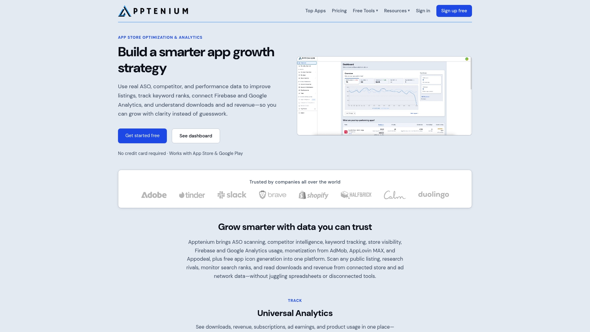
The app icon generator exports Play-ready icons sized and formatted to spec, keeping your icon and feature graphic visually consistent, which Google’s own guidelines flag as a quality signal. Pair that with Apptenium’s keyword tracking and competitor intelligence, and you move from guessing whether a new graphic helped to measuring it directly against listing CTR and organic install trends. Connect your Firebase or Google Analytics account and the performance data flows into the same dashboard.
Start a free scan of your current listing at Apptenium to see where your creative assets and metadata stand before your next graphic update.
The case for testing over perfecting
Most teams spend too long trying to design the “perfect” feature graphic and not long enough measuring whether any version is working. The spec is fixed: 1024×500, no alpha, safe zone respected. Everything beyond that is a hypothesis. A hero photo might outperform a brand banner for your category. A five-word headline might lift CTR more than a polished illustration. You will not know until you run the test.
The practical priority is this: ship a clean, spec-compliant graphic with one clear message, connect it to your listing metrics, and treat the first version as a baseline rather than a final answer. The teams that improve install conversion rates consistently are the ones that iterate on creative assets the same way they iterate on keywords: with data, not instinct.
Sources
Play Console Help — Feature image and other image guidelines
Complete Guide to Google Play Feature Graphic Design | StoreShots
Before publishing: verify any policy-sensitive elements (badges, pricing claims, ranking text) directly in Play Console’s current policy documentation, as guidelines update periodically.
FAQ
What is a Google Play feature graphic?
A feature graphic is a 1024×500 px banner uploaded in Play Console that appears at the top of your app’s store listing, in search results, and as the thumbnail for your promo video. It is the first visual users see before screenshots or the app description.
Where can I find templates for Google Play feature graphics?
Figma Community, Dribbble’s feature graphic tag, and paid marketplaces like Creative Market offer free and paid templates pre-sized at 1024×500 px. hotpot.ai generates AI-assisted templates at Play-ready dimensions with minimal setup.
What are the key design features of a strong feature graphic?
One clear value proposition, high contrast between text and background, visual cohesion with the app icon, and all critical content inside the central ~820×400 safe zone. Avoid device mockups, ranking badges, and more than two text elements.
What are the main types of graphic design approaches for feature graphics?
Common approaches include hero photo plus logo, lifestyle split compositions, solid brand-color banners, and single bold illustrations. Each suits different app categories; the best choice depends on your brand recognition level and target audience.
How do I improve my feature graphic’s impact on installs?
Run A/B tests comparing headline vs. no headline and photo vs. abstract background, then track listing CTR and install rate per listing view in Play Console. Apptenium’s ASO analytics can help you connect creative changes to measurable shifts in organic install performance.