Design Once With a 1024×1024 Master: App Icon Sizes for Developers

Design Once With a 1024×1024 Master: App Icon Sizes for Developers
Design one vector master at 1024×1024 pixels, then export from it. Two sizes matter more than any other: 1024×1024 for the App Store listing (opaque PNG, no transparency, no pre-rounded corners) and 512×512 for Google Play (32-bit PNG). If you’re building Android adaptive icons, plan for two 108×108dp layers with your logo mark centered inside the safe zone, since launchers crop the edges differently across devices.
TL;DR:
- Using a single 1024×1024 vector master simplifies exporting all platform-specific icon sizes and reduces the risk of inconsistent assets or rejected submissions.
- Apple requires an opaque 1024×1024 PNG for the App Store listing, with no transparency or pre-rounded corners, since the system masks and applies effects at render time.
- Android adaptive icons must keep the logo within a central safe zone of approximately 66dp radius on a 108×108dp canvas to prevent clipping across different device launchers.
- Windows offers flexible icon sizing from 16×16 to 256×256 pixels, with PNG transparency supported, and chooses the best-fit size at runtime based on context.
- Automated tools like Xcode’s asset catalog, Image Asset Studio, and app icon generators help generate all required sizes from a vector master, saving time and minimizing scaling errors.
Table of Contents
- App Icon Sizes at a Glance: The Reference Table
- Apple Icon Rules: iOS, iPadOS, macOS, and Watch Exceptions
- Android Adaptive Icons and Google Play’s Safe Zone Math
- Windows Icon Sizes and Manifest Basics
- The Export Workflow: From Vector Master to Store-Ready Files
- Tools That Do the Resizing for You
- Testing Icons Before You Submit
- Accessibility: Designing Icons People Can Actually Recognize
- Why a Vector Master Actually Saves You Time
- Generate Every Icon Size Without Touching a Resizer
- Sources
- FAQ
App Icon Sizes at a Glance: The Reference Table
Every platform has its own export ladder, and mixing them up is the fastest way to get a listing bounced. This table covers the sizes you’ll actually export for submission and in-app use, from store masters down to legacy Android densities.
A few things to note beyond the numbers. Android’s density ladder (mdpi through xxxhdpi) exists because devices ship with wildly different pixel densities, and the OS still expects legacy PNG exports in res/mipmap-*/ folders even though adaptive icons have been standard since Android 8.0. macOS is the outlier here: it maps each nominal size to an @[1x](https://developer.apple.com/design/human-interface-guidelines/icons) and @2x file, so a “32×32” icon slot actually needs a 32px and a 64px PNG sitting side by side in the asset catalog. Windows, by contrast, doesn’t map pixel densities at all. It just picks whichever size in your ladder fits the display context best, which is why Microsoft’s guidance recommends supplying the full range rather than guessing which one Windows will grab.

Apple Icon Rules: iOS, iPadOS, macOS, and Watch Exceptions
Apple’s Human Interface Guidelines are specific about one thing above all: the App Store master must be a full-bleed, opaque 1024×1024 PNG. No alpha channel, no transparency, and critically, no pre-rounded corners. The system applies its own masking and shines effects at render time, so a corner radius you baked in yourself will clash with what iOS draws on top of it.
- App Store listing icon: 1024×1024, opaque, full-bleed square
- Home screen and Spotlight icons: derived from the master through point-to-pixel scaling (@2x and @3x multipliers)
- macOS icons: follow the 16 to 1024 ladder with separate @1x and @2x files per size.
- watchOS and tvOS: use different canvas shapes and sizes entirely, so layered artwork often needs a dedicated pass rather than a simple resize
Pro Tip: Keep your corner radius out of the master file entirely. Let Xcode’s asset catalog and the OS apply the mask. Submitting a pre-rounded 1024 icon is one of the more common reasons designers get confused when their listing icon looks “double rounded” in review.
Android Adaptive Icons and Google Play’s Safe Zone Math
Android adaptive icons work in layers, not flat files. You supply a foreground and a background, each sitting on a 108×108dp canvas, and the launcher composites them at runtime with whatever mask shape that device manufacturer prefers (circle, squircle, rounded square). That variability is exactly why the safe zone matters.
- Keep your logo mark inside the central safe circle, roughly a 66dp radius from center, since anything outside that zone risks getting clipped on some launchers
- Final Play Store artifact: 512×512, 32-bit PNG, sRGB color space, capped at 1024KB
- Google Play applies its own corner radius and shadow at display time, so don’t bake in a drop shadow or you’ll get a doubled effect
- Legacy launcher sizes (48 through 192px across densities) still ship alongside adaptive layers for backward compatibility, landing in
res/mipmap-mdpi/throughres/mipmap-xxxhdpi/
That 108dp canvas with a roughly 66dp safe zone means nearly 40% of the total layer area can be cropped depending on the launcher’s mask shape. Design your foreground mark small enough to survive the tightest crop, not the most generous one.
Windows Icon Sizes and Manifest Basics
Windows takes a more forgiving approach than Apple or Google. Rather than mandating one master format, Microsoft’s construction guidance recommends a ladder covering small icons (16×16, 24×24, 32×32, 48×48) up through 256×256 for high-resolution contexts like tiles and the taskbar.
- Windows selects the best-fit size at runtime rather than forcing you to specify context by context
- MSIX manifest entries reference your icon set directly, so naming consistency across the ladder saves packaging headaches later
- PNG works for most modern contexts, though
.icostill shows up in legacy desktop scenarios - Transparency is generally accepted on Windows, a real contrast to the App Store’s opaque-only rule
The Export Workflow: From Vector Master to Store-Ready Files
The whole point of designing at 1024×1024 in a vector tool is that you only solve the hard design problems once. Every platform-specific size is then a mechanical export, not a redesign.
- Build your icon as a scalable vector at 1024×1024, keeping strokes and details proportional to that canvas.
- Export the App Store master as an opaque PNG with no alpha channel and no baked-in corner rounding.
- Export the Google Play master as a 32-bit sRGB PNG, checking it lands under the 1024KB ceiling.
- Generate Android density variants (mdpi through xxxhdpi) plus adaptive foreground/background layers, keeping consistent filenames across the set.
- Drop iOS assets into your Xcode asset catalog and Android assets into the matching
res/mipmap-*/folders. - Repeat the export for macOS and Windows ladders only if your app targets those platforms.
Pro Tip: Name your export files by size and platform, not by version number (“icon_ios_1024.png” beats “icon_final_v3.png”). It sounds trivial until you’re troubleshooting a rejected build at midnight and can’t tell which file went where.
Tools That Do the Resizing for You
Manual resizing invites rounding errors and blurry edges, especially once you’re juggling a dozen sizes across three platforms. Xcode’s asset catalog takes a single 1024 source image and generates the iOS ladder automatically. On the Android side, Image Asset Studio builds adaptive foreground and background layers, drops legacy density exports into the right mipmap folders, and produces the 512×512 Play Store artifact in one pass.
- Always export from a vector source, never from an already-rasterized PNG, to avoid scaling artifacts creeping in at smaller sizes
- Batch resizer tools help when you need dozens of variants quickly, but double-check color space and bit depth on the output
- For rapid concept testing before you commit to a final vector, tools like AmmarAI’s image generator can help you visualize a few directions fast.
- An App Icon Generator produces iOS and Android-ready asset sets from one upload and can flag basic listing issues at the same time
Testing Icons Before You Submit
A design that looks sharp on a 27-inch monitor can turn into a smudge at 29px in Settings. Run these checks before you ship anything to review.
- Place your icon in a grid next to 15 to 20 competitor icons from your category to see how your color and silhouette hold up in a real store screenshot.
- Shrink the icon to 40px and 29px and check whether the core shape still reads clearly.
- Overlay Android’s safe zone guide to confirm nothing meaningful falls outside the visible crop area.
- Verify PNG bit depth, color space, and file size against each platform’s limits, then confirm assets sit in the correct project folders.
Pro Tip: Testing your icon in an actual store mockup next to real competitors reveals contrast problems an isolated artboard never shows. A color that pops in isolation can disappear next to five other blue icons in a search results row.
Accessibility: Designing Icons People Can Actually Recognize
An app icon has one job at a glance: signal what the app is before the user reads a single word. That’s an accessibility problem as much as a branding one. Low-vision readers, older users, and anyone glancing at a phone in bright sunlight all rely on the same thing your competitor grid test reveals: strong contrast and a distinct silhouette.
Contrast between your foreground mark and background color needs to survive more than a lab-lit monitor. Test your icon against a bright outdoor screenshot and a dimmed nighttime one, since the actual conditions where someone taps your icon vary far more than your design review does. A mark that depends on subtle gradients or thin strokes tends to lose definition first when the screen brightness drops or the eyesight isn’t perfect.
Recognizability matters just as much as contrast. Icons built around a single bold shape, like a distinct letterform or a simple object silhouette, tend to hold up better across sizes and squint tests than icons packed with fine detail or small text. If your icon only makes sense after someone reads the caption underneath it, the shape isn’t doing its job yet.

Color choice deserves a second look too. Relying on a red versus green distinction as your only differentiator will fail for the segment of users with red green color blindness, so pair color choices with shape and value contrast rather than color alone.
Why a Vector Master Actually Saves You Time
Keeping one vector master instead of a folder of hand-resized PNGs isn’t a nice-to-have, it’s what keeps a two-week icon revision from turning into two months. Most submission rejections I’ve seen trace back to inconsistent exports, not bad design: a pre-rounded corner here, a stray alpha channel there. Automate the resizing and you remove the part of the process most likely to introduce that kind of error.
— Mike
Generate Every Icon Size Without Touching a Resizer
Building a matching set of icons by hand across iOS, Android, and legacy densities eats hours you could spend refining the mark itself. Apptenium’s App Icon Generator takes your single 1024×1024 master and outputs the iOS and Android asset sets described throughout this guide, ready to drop into your project without a manual export pass.
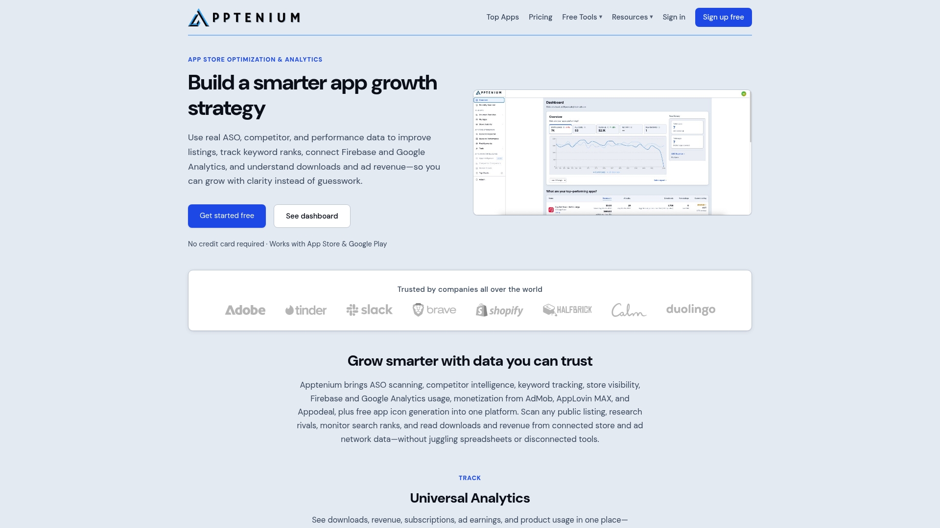
The generator sits inside a broader ASO toolkit, so once your icon is ready you can check how it reads in store search previews, track the keywords competing apps rank for, and see how your listing performs against rivals in the same category. That’s the part resizing tools never cover: an icon that passes the grid test still needs a listing strategy behind it to actually get found. If you’re managing app assets and store performance without a dedicated system, Apptenium’s ASO plan is built to cover both from one dashboard. Start with a free scan of your current listing and see where your icon and metadata stand today.
Sources
FAQ
How Do I Change My App Icon Size After It’s Already Submitted?
Update your vector master, re-export the required sizes for each platform (1024×1024 for the App Store, 512×512 for Google Play), and upload the new assets through App Store Connect or the Google Play Console as part of a new build submission.
What Is a .icns File?
A .icns file is Apple’s icon container format for macOS apps, bundling multiple resolutions (16×16 up to 1024×1024 with @1x/@2x variants) into a single file that macOS reads depending on context, such as the Dock, Finder, or Launchpad.
Why Did My Home Screen Icons Suddenly Get Bigger?
This usually happens after an iOS or Android system update changes the default icon grid size or display scaling settings, not because of anything in your app’s own icon files.
How Do I Get My Icons Back to Their Normal Size?
Check your device’s display and accessibility settings first, since a system-level zoom or larger-icon-grid setting is the most common cause; if only one app’s icon looks wrong, reinstalling it after confirming your exported asset sizes match platform specs usually resolves it.
Do I Need Different Files for iPhone and iPad Icons?
No single extra design is required. Both derive from the same 1024×1024 master through Apple’s point-to-pixel scaling, so one properly exported set covers iPhone, iPad, and macOS Catalyst apps built from the same project.