Convert App Icons for Liquid Glass and Android Adaptive with Apptenium
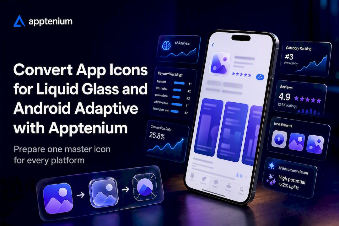
Convert App Icons for Liquid Glass and Android Adaptive with Apptenium
Make a flattened PNG master for Apple at high resolution, a Play listing asset at store-required resolution, plus separate foreground and background layers for Android’s adaptive icon system, then run app icon conversion through an online generator or Xcode’s Icon Composer and Android Studio’s Image Asset Studio to produce a ready-to-ship .appiconset and mipmap package. Strip any alpha channel before you touch Apple’s upload, keep your focal shape inside Android’s safe zone, and check the result as a silhouette at 40 to 60 pixels before you call it done.
TL;DR:
- Using a 1024×1024 PNG without alpha channel as the Apple master ensures seamless automatic resizing for all iOS icon sizes.
- Android’s adaptive icons require separate foreground and background layers centered within a safe zone, with full control over appearance across devices.
- Online generators speed up icon creation but lack layered control, whereas IDE tools like Icon Composer and Image Asset Studio offer precise customization at a slightly slower pace.
- Verifying icons at thumbnail sizes and ensuring clear focal shapes, high contrast, and distinctive colors improve recognition during app store searches.
- Keeping layered source files in version control allows quick re-exporting when platform specs change, saving time on redesigns.
Table of Contents
- What Sizes Does App Icon Conversion Actually Require?
- Which Tools Convert Icons Fastest Without Breaking Specs?
- How Do You Convert an Existing Icon Into Every Required Format?
- What Platform Rules Cause the Most Icon Rejections?
- What Makes an Icon Recognizable at Thumbnail Size?
- Using Apptenium’s App Icon Generator in a Real Conversion Workflow
- Speed or Control: Which Should Win Your Icon Workflow?
- Where to Get Icon Conversion and ASO Tools in One Place
- Where to Verify the Exact Specs Yourself
- Sources
- FAQ
What Sizes Does App Icon Conversion Actually Require?
Every platform wants one clean master, then a set of derivatives built from it. Get the master right and the rest of app icon conversion is mostly mechanical.
Apple’s requirement is a single 1024×1024 PNG with no alpha channel, uploaded through Xcode’s asset catalog or the newer Icon Composer workflow. Apple’s Human Interface Guidelines treat this master as the source of truth. Xcode generates every smaller iPhone, iPad, and Settings-icon size automatically from it, so you never manually export dozens of iOS sizes yourself.
Android works differently because launcher icons are adaptive, built from two separate layers instead of one flat image:
- Foreground layer: your logo or mark, transparent background, roughly 108×108dp with the visible content centered inside the middle 66% (the safe zone)
- Background layer: a solid color or simple pattern, same canvas size
- Play Store listing icon: 512×512, 32-bit PNG, sRGB color space
- watchOS note: complication and app icon sizes derived from a 1088×1088 master if you support Apple Watch
Android Studio’s Image Asset Studio takes those two layers and drops the generated files into density-specific mipmap folders (mdpi through xxxhdpi) automatically. You never hand-place a single PNG into res/mipmap-hdpi again once the tool has your layers.
Which Tools Convert Icons Fastest Without Breaking Specs?
Your choice comes down to how much layered control you need versus how fast you need output. Online generators win on speed. IDE-native tools win on precision.
An online generator workflow is simple: upload one master image, the tool detects platform targets, and it returns a ZIP with an Xcode-ready .appiconset folder and an Android mipmap/adaptive icon set already sized and named correctly — just like the best mobile app builder for launching a real business faster suggests for efficient app production. That’s the right call when you’re iterating on concepts fast or don’t need separate foreground and background art yet.
Image Asset Studio and Icon Composer earn their place when you need actual layered control:
- Image Asset Studio (inside Android Studio): right-click
res→ New → Image Asset → pick Adaptive and Legacy → drop in your foreground and background art → it generates every density folder and a Play-ready 512×512 export in one pass. - Icon Composer (Apple’s tool): build your icon as layers rather than a flat file, preview it across Apple’s appearance modes, then export the asset catalog Xcode expects.
- CLI/scriptable options: for teams running CI, scriptable exporters can regenerate a full platform asset set from one source file on every build, which matters once you’re running icon A/B tests and need fast re-exports.
Pro Tip: Keep your layered source (Figma, Sketch, or SVG) in version control, separate from the exported PNGs. When Apple or Google shifts a spec, you re-export in minutes instead of rebuilding art from scratch.
How Do You Convert an Existing Icon Into Every Required Format?
Most icon rejections trace back to skipping one of these steps, not a design flaw. Following them in order gets you a shippable package on the first try.
- Build or choose your master. Flatten a 1024×1024 PNG for the Apple submission. If you’re also targeting Android, keep a layered source with your mark isolated from any background art.
- Prepare Android’s adaptive layers. Split foreground and background, and keep the visible logo centered in the inner 66% of the canvas. Anything outside that zone gets clipped by different launcher mask shapes across devices.
- Export the packages. Run your master through an online generator for a quick full-set ZIP, or use Icon Composer and Image Asset Studio when you need layered appearance-mode control. Either route should output an Xcode
.appiconsetand the Android mipmap/adaptive resource folders. - Verify before upload. Confirm the Apple export has zero alpha, preview both icons at 40px and 60px, run a silhouette check by desaturating the image to black, and confirm the Play Console asset meets the 512×512, 32-bit PNG, sRGB requirement.
Icons that pass a silhouette test at thumbnail sizes tend to perform better in store search results, which makes step four worth the extra two minutes it takes.
What Platform Rules Cause the Most Icon Rejections?
Apple’s biggest recent shift is Liquid Glass. The system now renders dynamic appearance effects, reflections, and depth on top of your artwork, so baking in your own drop shadows, glows, or bevels creates visual conflict instead of polish. Apple’s guidance on Liquid Glass treats icons as layered materials the system finishes rendering, not a final flattened image.
Google’s rules are stricter about what you don’t add rather than what you include. The Play icon specification calls for full-bleed, square artwork because Play Console applies the corner mask and shadow itself.
The recurring mistakes worth flagging before you submit anything:
- Transparency where it’s forbidden. Apple rejects App Store icons with an alpha channel; flatten it out.
- Pre-rounded corners or added shadows. Both Apple and Google mask and shade icons themselves; supplying your own creates double-masking artifacts.
- Binary/listing mismatch. Your uploaded Play Store 512×512 icon and the icon inside your APK/AAB need to match, or reviewers flag it.
- Design too close to another app’s mark. Both stores reject icons that visually impersonate an existing, recognizable brand.
What Makes an Icon Recognizable at Thumbnail Size?
Most icons fail not because they’re ugly, but because they collapse into mush at 40 pixels. One focal shape, high contrast, and a color that doesn’t blend into your category’s usual palette are what survive the shrink.
Skip text entirely; it’s unreadable below 60px regardless of font choice. Skip thin strokes too. They vanish into anti-aliasing artifacts on lower-density Android screens. Pick a background color that stands apart from what five competing apps in your category are already using, and check your mark still reads clearly when Android renders it as a monochrome themed icon, since low-contrast marks can wash out completely in that mode.
Once you’ve narrowed to two strong candidates, run an actual test rather than trusting your eye. Both App Store Connect and Play Console support listing experiments that split traffic between icon variants; change only the icon between versions, let the experiment run until you’ve got enough impressions to trust the gap, and track tap-through rate as your primary signal.
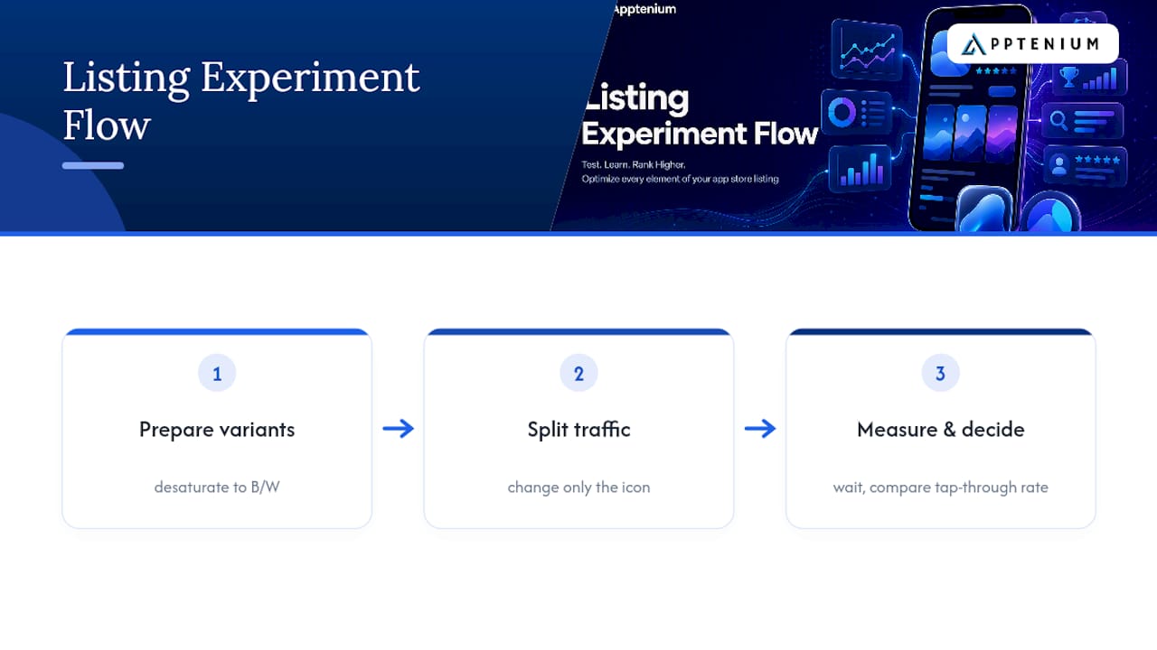
Pro Tip: Desaturate your two finalists to pure black and white before the store test. If you can’t tell them apart at a glance, your audience won’t either.
Using Apptenium’s App Icon Generator in a Real Conversion Workflow
Apptenium’s App Icon Generator fits at the fast-iteration stage of app icon conversion. Upload one master image and it returns a 1024×1024 Apple-ready file alongside a full platform package, an Xcode-ready .appiconset and Android mipmap set already sized and named to spec.
- Treat generator output as final when your icon is a simple mark with no layered appearance-mode needs.
- Reopen the file in Icon Composer or Image Asset Studio when you need separate foreground/background control for Liquid Glass or Android themed icons.
- Once you’ve shipped a variant, connect the result to real performance data through Apptenium’s ASO scanner, which ties icon changes to shifts in listing metrics instead of leaving you guessing whether the new mark actually moved installs.
Speed or Control: Which Should Win Your Icon Workflow?
Most teams overthink this trade-off. Generate three or four concepts fast, silhouette-test them yourself, then let a real store experiment pick the winner before you spend an hour in Icon Composer polishing art nobody will tap on. Keep one layered master under version control so re-exporting for the next platform spec change takes minutes, not a redesign.
— Mike
Where to Get Icon Conversion and ASO Tools in One Place
Running icon variants through separate generators, then separate ASO trackers, then separate analytics dashboards is exactly the fragmentation Apptenium was built to remove. Apptenium’s App Icon Generator exports your Apple and Android asset packages in one pass, and because it lives inside the same platform as Apptenium’s ASO features, you can track how an icon swap actually moves your keyword rankings and install rate without stitching together three separate tools.
Startups and solo developers can run icon exports and a limited number of ASO scans on Apptenium’s free tier before deciding whether the paid plan is worth it. If you’ve been comparing platforms, the Apptenium versus Appfigures breakdown lays out where each tool fits. Either way, start with a free icon export and see what an Xcode-ready asset package looks like in under a minute.
Where to Verify the Exact Specs Yourself
- Apple Human Interface Guidelines: App Icons
- Android Studio: Create App Icons
- Google Play Icon Design Specifications
- Adopting Liquid Glass — Apple Developer Documentation
If you’re also shipping to Windows, check Microsoft’s own app icon design rules separately. They don’t follow either Apple’s or Google’s conventions.
Sources
- App Icon design guidance | Apple Human Interface Guidelines
- Create app icons | Android Studio
- Google Play icon design specifications
- Adopting Liquid Glass (Apple developer technology overview)
- App Icon Design Guide 2026 — How to Design an Icon That Gets Tapped | WhixFrame
FAQ
What size should my main app icon master be?
Build a 1024×1024 flattened PNG for Apple with no alpha channel. Keep a separate layered source for Android’s foreground and background if you’re also shipping there.
Do I need different icons for Android and iOS?
Yes. Apple uses one flat master that Xcode resizes automatically, while Android needs distinct foreground and background layers to support adaptive and themed icon rendering.
Why did my icon get rejected from the App Store?
The most common causes are an alpha channel on the 1024×1024 upload, a mismatch between your binary’s icon and your listing icon, or artwork that resembles another app’s existing mark.
Can I convert one image into every required size automatically?
Yes. An online generator like Apptenium’s App Icon Generator can turn a single master into a full Xcode asset catalog and Android mipmap package, though you should still verify alpha channels and safe zones before submitting.
How do I know if my icon is legible at small sizes?
Shrink it to 40 to 60 pixels and desaturate it to check the silhouette; if the shape blurs into an unrecognizable blob at that size, simplify it before testing further.